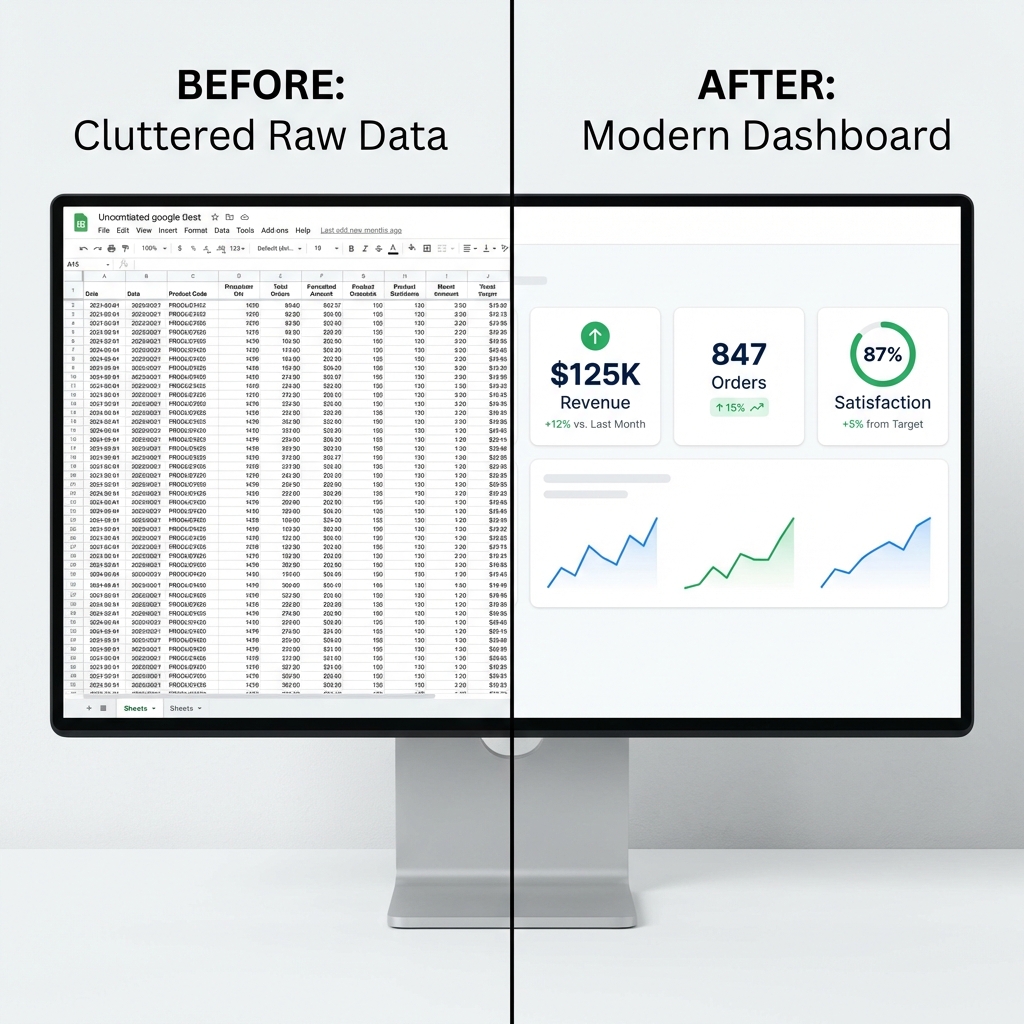
We've all been there: you send a spreadsheet to your boss, and they reply, "What am I looking at?"
The problem isn't the data; it's the cognitive load. A grid of 5,000 numbers requires mental math to decode. A well-designed Google Sheets dashboard requires none.
The solution is a Layered Dashboard Framework—a proven approach to Google Sheets data visualization that mimics how humans actually process information: first the score, then the trend, then the detail. Instead of throwing a pie chart at the problem, this approach builds interactive Google Sheets dashboards that tell a story.
Here is how to build your own Google Sheets dashboard, layer by layer—this is your complete Google Sheets dashboard tutorial.
Google Sheets Scorecards: The Executive Glance
The Goal: Answer "Are we okay?" in 3 seconds.
Before you build anything, ask yourself: If my stakeholder has 10 seconds before their next meeting, what's the ONE number they need to see? That's your scorecard. Everything else is noise.
Start your dashboard with Scorecard Charts. These are big, single numbers that act as headlines. Don't hide them in rows; put them at the very top, large and bold.
How to build it: Insert > Chart > Chart Type > Scorecard.
In the setup panel, set your data range to a single cell (e.g., B2 for total revenue). Under "Key Value," reference that cell. Under "Baseline Value," reference your comparison metric (e.g., B3 for last month's revenue).
Analyst Tip: Context is King. A scorecard that says "$50k Revenue" is useless. Is that good? Bad? Use the "Key Value" and "Baseline Value" fields to show % change vs. last month. If it's not red or green, it's not a decision. The number alone is just trivia.
A common mistake: showing the number but not the meaning. "$50k" tells you nothing. "$50k (+22% vs. last month)" tells you to keep doing what you're doing.
Using Sparklines for Trend Analysis
The Goal: Show direction without clutter.
Once they know the score (Layer 1), they need to know the momentum. Is that $50k trending up or crashing down? Use sparklines in Google Sheets—tiny charts that live inside cells.
Instead of a giant line chart that dominates the screen, add a "Trend" column next to your data tables:
=SPARKLINE(B2:M2, {"charttype","line"; "linewidth",2; "color","#0F9D58"})
This keeps your dashboard dense with information but visually clean.
Pro Tip: When NOT to Use Sparklines. If the trend is the entire story (e.g., stock prices, daily traffic), don't use sparklines—use a full chart. Sparklines are for context, not deep analysis. If your stakeholder will ask, "But what happened on the 15th?", they need a real chart with hover details.
Interactive Filtering with Google Sheets Slicers
The Goal: Let them answer their own questions.
Static dashboards generate follow-up emails ("Can you pull this for Q3?"). Interactive dashboards generate answers.
Slicers are visual buttons that filter every chart on the page instantly. Stop creating 12 separate tabs for "North Region," "South Region," etc. Create one master view and add Slicers for Region, Date, and Category.
Analyst Tip: The Rule of 3. Never add more than 3 slicers. If you give stakeholders 10 knobs to turn, they will inevitably create a view with zero data and blame the report. I call this "Slicer Hell." Limit their options to the logic that matters: usually Time, Geography, and Category.
The psychology here is critical. More options feel empowering, but they're paralyzing. Three slicers force decision-makers to think about what question they're asking instead of randomly clicking until something interesting appears.
Creating Heatmaps with Conditional Formatting
The Goal: Make patterns pop from the table.
Some data needs to remain in a table. But a raw table is unreadable. A Google Sheets conditional formatting heatmap turns a table into a visual map, allowing the eye to scan for outliers instantly.
Use "Color Scales" (Minpoint: Red, Maxpoint: Green) for performance metrics. Suddenly, a 50-row sales report becomes a map of where the problems are.
Pro move: Use "Data Bars" (Gradient fill) to create mini-bar charts inside cells, allowing for quick comparison of magnitude without standardizing the axis. Your stakeholder can see at a glance that the West region did 3x the volume of the East region without reading numbers.
Interactive Charts: The Deep Dive Layer
The Goal: Answer the follow-up questions.
Scorecards, sparklines, and heatmaps tell you what is happening. Interactive charts tell you why.
For your deep-dive layer, use combo charts (bar + line) to show both volume and rate on the same visual. Example: monthly orders (bars) with conversion rate (line) overlaid. This reveals whether growth is from more traffic or better conversion.
How to build it: Insert > Chart > Combo chart. Assign primary metrics to bars (left axis) and rate metrics to the line (right axis). Add a descriptive title that states the insight, not just "Sales Data."
Pro Tip: The Hover Test. If stakeholders need to hover over data points to understand the chart, it's too complex. Add data labels to the most important points (peak, trough, current) so the insight is visible without interaction.
Common Dashboard Mistakes to Avoid
If you want your dashboard to fail, here's the recipe:
Anti-Pattern 1: Chart Junk. Using 12 different colors because "it looks pretty." Humans can't process more than 5-7 colors before the brain gives up. If your chart looks like a rainbow, you've lost. Stick to 3 colors max: one for good, one for bad, one for neutral.
Anti-Pattern 2: Misleading Axes. Starting your Y-axis at 90 instead of 0 to make a 5% increase look dramatic. This is the fastest way to destroy trust. If someone catches you doing this once, they'll never believe your dashboards again.
Anti-Pattern 3: No Baseline. Showing "847 orders this month" without last month's number. Congratulations, you've made trivia, not a decision tool. Every metric needs a comparison: vs. last period, vs. target, vs. something.
Google Sheets is powerful, but it's not a BI tool. Here's when to upgrade:
Stay in Sheets if:
- Data < 10,000 rows
- Audience is internal team (not clients)
- Updates are weekly, not real-time
- Budget is $0
Graduate to Looker Studio if:
- Data is 10K-100K rows
- You're sharing with clients or executives
- You need to separate data from presentation (so no one accidentally deletes formulas)
- It's free, connects natively to Sheets
Upgrade to Tableau/Power BI if:
- Data > 100K rows
- You need real-time or near-real-time updates
- You're building executive-level dashboards
- Budget exists ($70-$150/user/month)
Decision Framework: Don't Overbuild. A common mistake is spending 3 months building a Tableau dashboard for a dataset with 500 rows. The rule: start in Sheets, migrate when it breaks. The dashboard is breaking when it takes >10 seconds to load or when someone accidentally breaks a formula and the whole thing crashes.
AI-Generated Dashboards: The Future of Data Visualization
The "Layered Framework" works, but it takes time to build. The next evolution is skipping the build entirely.
Tools like Anomaly AI allow you to connect a Google Sheet and simply ask, "Show me revenue trends by region." The AI acts as your analyst, building the visualization layer instantly based on your query.
It's not just about saving time; it's about agility. You don't need to rebuild the dashboard when the question changes—you just ask a new question. The dashboard adapts to your curiosity, not the other way around.
Connect your Sheets to Anomaly AI and start asking questions →
Frequently Asked Questions
Q: How many charts should a dashboard have?
A: If you're showing more than 7 visual elements, you're overwhelming the viewer. The ideal dashboard has 3 scorecards, 2-3 charts, and 1-2 tables max. More than that, split it into multiple pages.
Q: Should I use pie charts?
A: Almost never. Humans are terrible at comparing angles. Use bar charts instead. The only time pie charts work is when you're showing 2-3 segments and one is clearly dominant (e.g., "80% of revenue comes from Product A").
Q: How often should dashboards update?
A: Ask yourself: what decisions will be made with this data, and how often? If it's a monthly review, update monthly. If it's real-time operations, update hourly. Don't build a real-time dashboard if the decision cycle is quarterly—you're just creating anxiety.