Data teams face a fundamental choice: code-based visualization in Python or R, or GUI-driven tools like Tableau and Power BI? This decision impacts development speed, customization capabilities, reproducibility, and team collaboration. According to the Tableau Analytics Whitepaper, organizations increasingly adopt hybrid approaches, using programming for custom analysis and GUI tools for stakeholder dashboards.
This comprehensive guide examines Python, R, and BI tools across performance, ease of use, capabilities, and ideal use cases—with code examples and real-world scenarios to inform your visualization strategy.
Understanding the Three Approaches
Python Visualization Ecosystem
Python dominates data science workflows with three primary visualization libraries:
Matplotlib: The foundational library for static, publication-quality plots. The 2025 release introduced GPU-accelerated rendering and native dark mode, improving performance for large datasets.
# Basic Matplotlib example
import matplotlib.pyplot as plt
import numpy as np

# Create sample data
x = np.linspace(0, 10, 100)
y = np.sin(x)

# Create publication-quality plot
plt.figure(figsize=(10, 6))
plt.plot(x, y, linewidth=2, color='#2E86AB')
plt.title('Sine Wave Visualization', fontsize=16, fontweight='bold')
plt.xlabel('X Axis', fontsize=12)
plt.ylabel('Y Axis', fontsize=12)
plt.grid(True, alpha=0.3)
plt.savefig('sine_wave.png', dpi=300, bbox_inches='tight')
plt.show()
Seaborn: Built on Matplotlib, Seaborn simplifies statistical visualization. Version 0.14 (2025) added native support for Polars DataFrames and automatic uncertainty intervals.
# Statistical visualization with Seaborn
import seaborn as sns
import pandas as pd

# Load sample data
tips = sns.load_dataset('tips')

# Create complex statistical plot with minimal code
sns.set_style('whitegrid')
g = sns.catplot(
    data=tips,
    x='day',
    y='total_bill',
    hue='sex',
    kind='violin',
    height=6,
    aspect=1.5,
    palette='muted'
)
g.set_axis_labels('Day of Week', 'Total Bill ($)')
g.fig.suptitle('Restaurant Bills by Day and Gender', y=1.02, fontsize=16)
plt.tight_layout()
plt.savefig('violin_plot.png', dpi=300)
Plotly: Specializes in interactive, web-ready visualizations. Plotly 7.0 (2025) introduced GPU acceleration and native DuckDB connectors for improved performance with large datasets.
# Interactive dashboard with Plotly
import plotly.graph_objects as go
import plotly.express as px

# Create interactive scatter plot
df = px.data.iris()
fig = px.scatter(
    df,
    x='sepal_width',
    y='sepal_length',
    color='species',
    size='petal_length',
    hover_data=['petal_width'],
    title='Interactive Iris Dataset Visualization'
)

# Add custom layout
fig.update_layout(
    template='plotly_white',
    hovermode='closest',
    font=dict(size=14)
)

# Export as interactive HTML
fig.write_html('interactive_iris.html')
fig.show()
R Visualization: ggplot2 Ecosystem
R's ggplot2, built on the Grammar of Graphics, excels at publication-quality statistical visualizations:
# ggplot2 layered visualization
library(ggplot2)
library(dplyr)

# Load and prepare data
data(mtcars)
mtcars$cyl <- as.factor(mtcars$cyl)

# Create multi-layered plot with Grammar of Graphics
ggplot(mtcars, aes(x = wt, y = mpg, color = cyl)) +
  geom_point(size = 3, alpha = 0.7) +
  geom_smooth(method = 'lm', se = TRUE, linetype = 'dashed') +
  facet_wrap(~cyl, ncol = 3) +
  scale_color_brewer(palette = 'Set2') +
  labs(
    title = 'Fuel Efficiency vs Weight by Cylinder Count',
    subtitle = 'Linear regression with confidence intervals',
    x = 'Weight (1000 lbs)',
    y = 'Miles per Gallon',
    color = 'Cylinders'
  ) +
  theme_minimal(base_size = 14) +
  theme(
    plot.title = element_text(face = 'bold', hjust = 0.5),
    legend.position = 'bottom'
  )

# Save publication-quality output
ggsave('mpg_analysis.png', width = 12, height = 8, dpi = 300)
BI Tools: Tableau and Power BI
GUI-based tools enable rapid dashboard creation without coding:
- Drag-and-Drop Interface: Build visualizations by dragging fields onto canvas
- Automatic Chart Selection: Tools suggest appropriate visualizations based on data types
- Interactive Dashboards: Built-in filtering, drill-down, and cross-filtering capabilities
- Enterprise Features: Role-based access, scheduled refreshes, and collaboration tools
Capability Comparison: Python vs R vs BI Tools
| Capability |
Python |
R (ggplot2) |
Tableau/Power BI |
| Statistical Plots |
Excellent (Seaborn) |
Outstanding (native) |
Good (limited advanced stats) |
| Interactive Dashboards |
Excellent (Plotly, Streamlit) |
Good (Shiny) |
Outstanding (native) |
| Custom Visualizations |
Outstanding (unlimited flexibility) |
Outstanding (Grammar of Graphics) |
Limited (predefined chart types) |
| Machine Learning Integration |
Outstanding (scikit-learn, TensorFlow) |
Excellent (tidymodels, caret) |
Limited (R/Python scripts required) |
| Real-Time Streaming |
Excellent (custom pipelines) |
Good (reactive programming) |
Excellent (native connectors) |
| Reproducibility |
Outstanding (version-controlled code) |
Outstanding (R Markdown) |
Limited (manual version tracking) |
| Publication Quality |
Excellent (Matplotlib) |
Outstanding (ggplot2 defaults) |
Good (requires styling) |
| Learning Curve |
Moderate to Steep |
Steep (Grammar of Graphics) |
Shallow (drag-and-drop) |
| Development Speed |
Medium (custom code) |
Medium (concise syntax) |
Fast (visual development) |
| Stakeholder Sharing |
Medium (export or web app) |
Medium (Shiny or export) |
Excellent (enterprise dashboards) |
Performance Benchmarks (2026 Data)
Rendering Speed: 1 Million Data Points
| Tool |
Static Plot |
Interactive Plot |
Notes |
| Matplotlib (GPU) |
1.2 seconds |
N/A |
2025 GPU acceleration for scatter plots |
| Plotly (GPU) |
2.8 seconds |
3.5 seconds |
WebGL rendering for interactivity |
| Seaborn |
1.5 seconds |
N/A |
Optimized for statistical plots |
| ggplot2 |
2.1 seconds |
N/A |
In-memory rendering |
| Tableau |
0.8 seconds |
1.1 seconds |
VertiPaq compression + caching |
| Power BI |
0.9 seconds |
1.3 seconds |
In-memory engine optimized |
Key Insight: BI tools outperform programming languages for standard chart types with large datasets, but programming offers more flexibility for custom visualizations and complex transformations.
When to Use Python
Ideal Use Cases
- Machine Learning Workflows: Seamless integration with scikit-learn, TensorFlow, PyTorch for predictive visualizations
- Custom Interactive Applications: Build web apps with Streamlit, Dash, or Flask for specialized use cases
- API Integration: Automate data fetching, transformation, and visualization from REST APIs
- Large-Scale Data Processing: Combine Pandas, Dask, or PySpark with visualization for big data workflows
- Reproducible Research: Jupyter Notebooks provide version-controlled, executable documentation
Real-World Example: Automated ML Model Performance Tracking
# Automated ML model performance dashboard
import pandas as pd
import plotly.graph_objects as go
from plotly.subplots import make_subplots
from sklearn.metrics import confusion_matrix, roc_curve, auc

# Simulate model predictions (replace with actual model output)
y_true = [0, 0, 1, 1, 0, 1, 1, 0, 1, 0]
y_pred = [0, 0, 1, 1, 0, 1, 0, 0, 1, 1]
y_scores = [0.1, 0.2, 0.8, 0.9, 0.3, 0.85, 0.4, 0.15, 0.95, 0.6]

# Create multi-panel dashboard
fig = make_subplots(
    rows=1, cols=2,
    subplot_titles=('Confusion Matrix', 'ROC Curve'),
    specs=[[{'type': 'heatmap'}, {'type': 'scatter'}]]
)

# Confusion matrix heatmap
cm = confusion_matrix(y_true, y_pred)
fig.add_trace(
    go.Heatmap(z=cm, x=['Predicted 0', 'Predicted 1'],
               y=['Actual 0', 'Actual 1'], colorscale='Blues'),
    row=1, col=1
)

# ROC curve
fpr, tpr, _ = roc_curve(y_true, y_scores)
roc_auc = auc(fpr, tpr)
fig.add_trace(
    go.Scatter(x=fpr, y=tpr, name=f'ROC (AUC = {roc_auc:.2f})',
               line=dict(color='#E63946', width=3)),
    row=1, col=2
)
fig.add_trace(
    go.Scatter(x=[0, 1], y=[0, 1], name='Baseline',
               line=dict(dash='dash', color='gray')),
    row=1, col=2
)

fig.update_layout(
    title_text='ML Model Performance Dashboard',
    showlegend=True,
    height=500
)

# Save and display
fig.write_html('ml_dashboard.html')
print(f'Dashboard saved with AUC: {roc_auc:.3f}')
Python Advantages
- ✅ Unlimited customization for unique visualization requirements
- ✅ Native integration with data science ecosystem (NumPy, Pandas, scikit-learn)
- ✅ Version control through Git for reproducible, auditable visualizations
- ✅ Cost-effective (free, open-source tools with no licensing fees)
- ✅ Automation capabilities for scheduled reporting and real-time updates
Python Limitations
- ❌ Steeper learning curve for non-programmers
- ❌ Slower development for standard business dashboards
- ❌ Requires additional infrastructure for web deployment (servers, hosting)
- ❌ Sharing with non-technical stakeholders requires export or web app creation
When to Use R and ggplot2
Ideal Use Cases
- Academic Research & Publications: ggplot2 produces publication-ready graphics with minimal styling
- Statistical Analysis: Native support for regression models, distributions, and hypothesis testing visualizations
- Genomics & Bioinformatics: Specialized packages (Bioconductor) for domain-specific visualizations
- Survey Data Analysis: Excellent tools for Likert scales, factor analysis, and categorical data
- Reproducible Reports: R Markdown integrates code, visualizations, and narrative seamlessly
Real-World Example: Clinical Trial Data Analysis
# Clinical trial survival analysis visualization
library(ggplot2)
library(survival)
library(survminer)
library(dplyr)

# Simulate clinical trial data
set.seed(42)
trial_data <- data.frame(
  time = c(5, 8, 12, 15, 20, 24, 30, 35, 40, 45),
  status = c(1, 1, 0, 1, 1, 0, 1, 0, 1, 0),
  treatment = rep(c('Drug A', 'Drug B'), each = 5)
)

# Fit survival model
fit <- survfit(Surv(time, status) ~ treatment, data = trial_data)

# Create publication-quality survival plot
ggsurvplot(
  fit,
  data = trial_data,
  pval = TRUE,
  conf.int = TRUE,
  risk.table = TRUE,
  risk.table.height = 0.25,
  xlab = 'Time (months)',
  ylab = 'Survival Probability',
  title = 'Clinical Trial Survival Analysis: Drug A vs Drug B',
  palette = c('#00AFBB', '#E7B800'),
  legend.title = 'Treatment',
  legend.labs = c('Drug A', 'Drug B'),
  ggtheme = theme_minimal(base_size = 14)
)

# Save for publication
ggsave('survival_analysis.png', width = 10, height = 8, dpi = 600)
R (ggplot2) Advantages
- ✅ Superior default aesthetics—publication-ready plots with minimal customization
- ✅ Grammar of Graphics enables complex, layered visualizations with concise syntax
- ✅ Extensive statistical packages (Bioconductor, tidymodels) for specialized domains
- ✅ R Markdown provides gold-standard reproducible research workflow
- ✅ Strong community in academia, healthcare, and research institutions
R Limitations
- ❌ Steep learning curve, especially Grammar of Graphics concepts
- ❌ Limited interactive dashboard capabilities (Shiny requires additional learning)
- ❌ Smaller ecosystem for machine learning compared to Python
- ❌ Memory constraints with very large datasets (>10GB) on standard systems
When to Use Tableau or Power BI
Ideal Use Cases
- Executive Dashboards: Rapid development of interactive KPI tracking for C-suite consumption
- Business Intelligence Reporting: Standard metrics (sales, revenue, customer analytics) with drill-down capabilities
- Non-Technical Teams: Empower business analysts to create visualizations without coding
- Enterprise Data Governance: Centralized data sources with role-based access and audit trails
- Client-Facing Deliverables: Polished, interactive dashboards for external stakeholders
Real-World Example: Sales Performance Dashboard
Tableau Workflow (No Code):
- Connect to Salesforce CRM via native connector
- Drag "Sales Rep" to Rows, "Revenue" to Columns
- Add "Quarter" filter for interactivity
- Create calculated field:
[Revenue] / [Quota] for quota attainment
- Apply color gradient: green (>100%), yellow (80-100%), red (<80%)
- Add trend lines and forecasting with one click
- Publish to Tableau Server with scheduled daily refresh
Development Time: 30 minutes vs 3-4 hours in Python/R for equivalent functionality
BI Tools Advantages
- ✅ Fastest time-to-dashboard for standard business visualizations (10-20x faster than coding)
- ✅ Zero programming knowledge required—accessible to business analysts
- ✅ Enterprise features (role-based access, scheduled refreshes, mobile apps) included
- ✅ Native connectors to 100+ data sources (databases, SaaS platforms, cloud warehouses)
- ✅ Excellent performance with large datasets (in-memory engines, query optimization)
BI Tools Limitations
- ❌ Limited customization—constrained to predefined chart types and layouts
- ❌ High licensing costs ($70-900/user/year for Tableau; $10-20/month for Power BI)
- ❌ Vendor lock-in—difficult to migrate dashboards between platforms
- ❌ Limited reproducibility—no version control for dashboard logic
- ❌ Advanced analytics require R/Python integration scripts
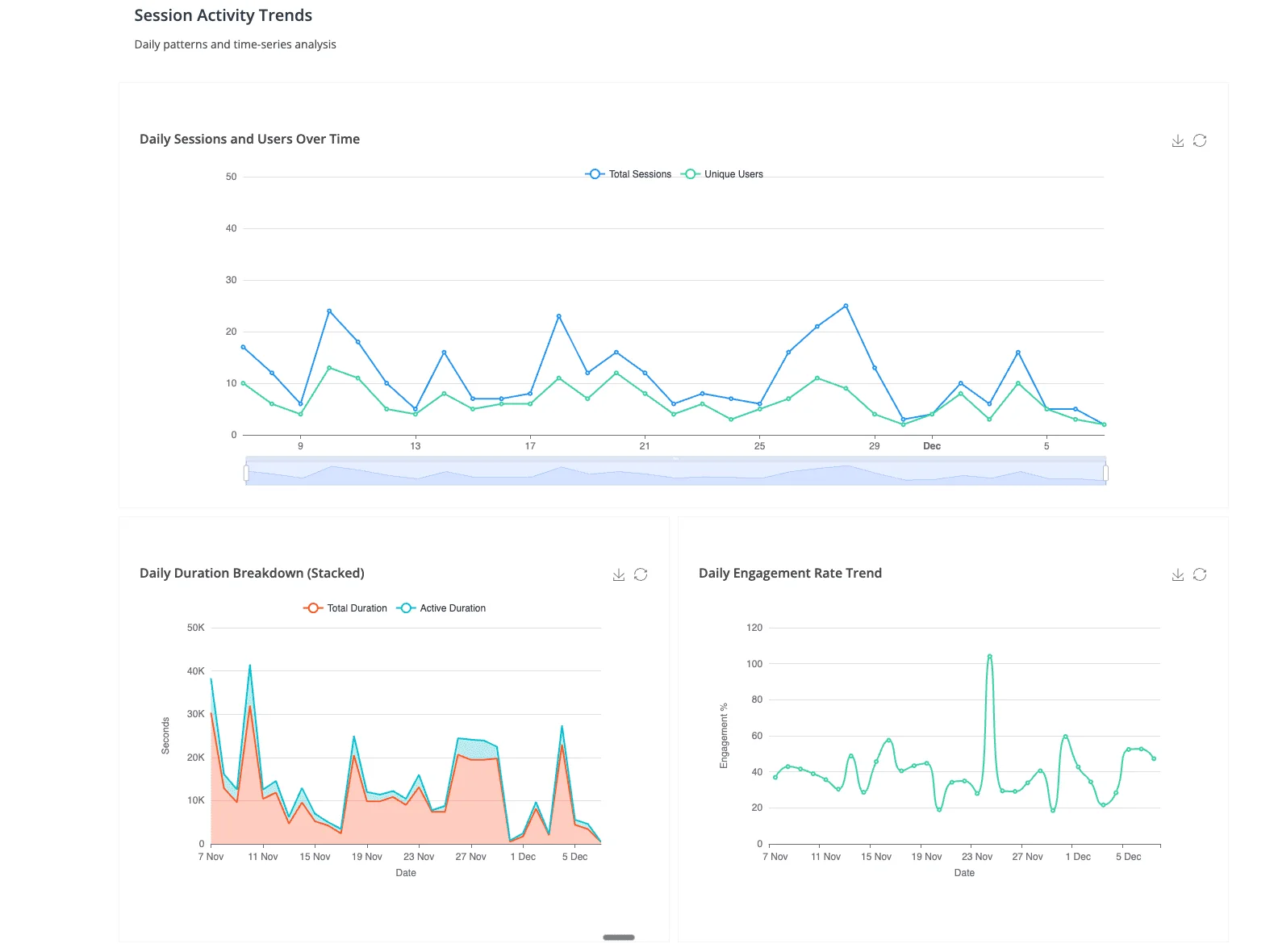
The AI-Native Middle Ground: Anomaly AI
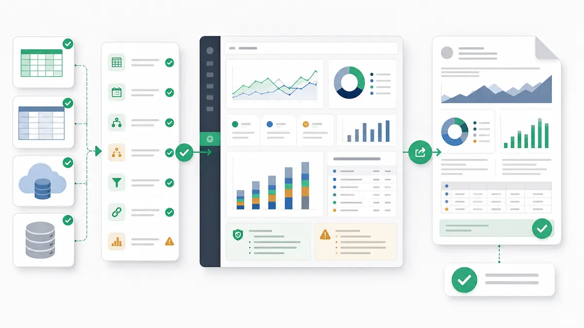
There is a third option that sits between coding libraries like Python and R and traditional BI tools like Tableau and Power BI. With Anomaly AI, teams can ask for dashboards, reports, PDFs, slides, docs, and scheduled updates in plain English, keep the output verifiable, and connect directly to the data sources they actually use — Excel, Google Sheets, GA4, ad account exports, BigQuery, and MySQL.
Where Python and R give you maximum flexibility at the cost of a long learning curve, and where Tableau and Power BI give you polished dashboards at the cost of months of modeling work, Anomaly AI flips the trade-off: you get inspectable logic without writing code, and you get the accessibility of a BI tool without having to assemble every output manually. For teams that need real analysis on large datasets — GA4 exports, warehouse data, spreadsheets that have outgrown Excel — this often removes the need to choose between "build it in Python" and "wait for the BI team."
The honest trade-off: if you need highly customized visualizations with full programmatic control, keep Python and R. If you need governed, pixel-perfect executive dashboards with row-level security across thousands of users, keep Tableau or Power BI. Everywhere else — the daily questions, the one-off investigations, the cross-source joins marketers and founders actually run — the AI-native middle ground is faster than either extreme.
Hybrid Approach: Best of All Worlds
Leading data teams combine tools strategically:
Workflow Example: E-Commerce Analytics
Python (Data Engineering & ML):
- Extract data from APIs (Google Analytics, Shopify, Facebook Ads)
- Clean, transform, and load into data warehouse (BigQuery, Snowflake)
- Build customer churn prediction model with scikit-learn
- Generate churn risk scores and store in database
R (Statistical Analysis):
- Conduct A/B test analysis for pricing experiments
- Create publication-quality plots for quarterly business reviews
- Generate automated R Markdown reports for data science team
Tableau (Executive Dashboard):
- Connect to data warehouse with churn scores from Python model
- Build interactive dashboard showing revenue, conversion rates, and churn risk
- Enable sales team to filter by region, product category, and customer segment
- Schedule daily refresh and email alerts for anomalies
Hybrid Model Benefits
- Leverage Strengths: Use programming for complexity, BI tools for accessibility
- Team Efficiency: Data scientists code, analysts build dashboards—parallel workflows
- Cost Optimization: Reduce BI tool licenses by using programming for development work
- Stakeholder Satisfaction: Technical depth + business-friendly interfaces
Decision Framework: Choosing Your Visualization Tool
Choose Python If:
- ✅ You need custom visualizations not available in standard chart libraries
- ✅ Your workflow involves machine learning, API integration, or complex data pipelines
- ✅ Reproducibility and version control are critical (research, regulated industries)
- ✅ You have programming expertise and time for custom development
- ✅ Budget constraints require free, open-source solutions
Choose R (ggplot2) If:
- ✅ You're conducting statistical research or academic publication
- ✅ Your work involves specialized domains (genomics, clinical trials, survey analysis)
- ✅ Publication-quality static plots are more important than interactivity
- ✅ You value the Grammar of Graphics approach for complex, layered visualizations
- ✅ Your team already uses R for statistical modeling
Choose Tableau/Power BI If:
- ✅ You need interactive dashboards deployed within 1-2 weeks
- ✅ Your team lacks programming expertise or prefers visual development
- ✅ Standard business metrics (sales, marketing, finance) are your primary focus
- ✅ Stakeholder sharing and enterprise governance are critical requirements
- ✅ Your organization already uses Microsoft ecosystem (Power BI advantage)
Use the Hybrid Approach If:
- ✅ You have diverse team skills (data scientists + business analysts)
- ✅ Your needs span custom analysis and standard business reporting
- ✅ You want to balance speed, flexibility, and accessibility
- ✅ You have budget for both BI tools and programming development time
Learning Curve and Training Investment
| Tool |
Time to Basic Proficiency |
Time to Advanced Mastery |
Training Cost |
| Python (Matplotlib/Seaborn) |
2-3 months |
12-18 months |
$0 (free online courses) to $2,000 (bootcamps) |
| Python (Plotly/Dash) |
3-4 months |
18-24 months |
$0 to $3,000 (includes web development) |
| R (ggplot2) |
3-4 months |
12-18 months |
$0 (free courses) to $1,500 (university courses) |
| Tableau Desktop |
2-4 weeks |
6-12 months |
$500-2,000 (certification programs) |
| Power BI |
1-3 weeks |
6-9 months |
$200-1,000 (Microsoft certifications) |
ROI Consideration: BI tools offer faster initial productivity but programming skills provide long-term flexibility and career value across multiple domains.
Future Trends: AI-Powered Visualization in 2026
Natural Language to Visualization
Tools like AI data analyst agents now generate Python/R code or Tableau dashboards from plain English queries:
"Create a scatter plot showing customer lifetime value vs acquisition cost, colored by industry segment"
The AI generates appropriate code or dashboard configuration, which can meaningfully compress development time for standard visualizations. Actual savings depend on how close the prompt is to a common pattern and how much post-generation editing the output needs.
Automated Insight Generation
Both programming libraries and BI tools now incorporate AI to automatically detect:
- Outliers and anomalies requiring investigation
- Significant trends and correlations in data
- Optimal chart types for specific data relationships
- Narrative summaries of visualization insights
Code-Free ML Integration
Tableau and Power BI now support drag-and-drop machine learning (forecasting, clustering, classification) without R/Python scripts, narrowing the capability gap with programming approaches.
Conclusion: A Tool for Every Need
The Python vs R vs BI tools debate has no universal winner—success depends on matching tools to use cases:
- Python: Maximum flexibility, ML integration, automation, and reproducibility
- R (ggplot2): Statistical rigor, publication quality, and specialized domain expertise
- Tableau/Power BI: Speed, accessibility, enterprise features, and stakeholder-friendly interfaces
The most effective data teams don't choose one approach—they strategically combine tools, using programming for custom analysis and BI platforms for broad accessibility.
Next Steps: Master Data Visualization
Ready to build compelling data visualizations?
Want the power of programming with the simplicity of BI tools? Try Anomaly AI—our platform combines natural language querying, automated Python/R code generation, and interactive dashboards to deliver professional visualizations in minutes, not hours.
Related Reading: