Organizations building data dashboards face a critical platform choice that impacts performance, cost, and user experience. In practice, dashboard quality is one of the most reliable predictors of whether an analytics project actually drives business value — too many dashboards end up underutilized because they were designed around what the data team could ship, not around the decisions the business actually needed to make.
In this comprehensive guide, we'll show you exactly how to build production-ready dashboards on both Google BigQuery and Snowflake, covering architecture decisions, tool selection, performance optimization, and real-world implementation patterns that scale.
Dashboard Architecture: BigQuery vs Snowflake Foundations
Before choosing your dashboard tools, understanding the architectural differences between BigQuery and Snowflake is essential for optimal performance.
BigQuery Dashboard Architecture
BigQuery's serverless architecture provides unique advantages for dashboard workloads:
- Automatic Query Optimization: BigQuery automatically optimizes dashboard queries using columnar storage and partition pruning, which meaningfully reduces query costs for time-series dashboards
- BI Engine In-Memory Acceleration: The BigQuery BI Engine caches frequently accessed dashboard data, delivering sub-second response times for interactive visualizations
- Separation of Storage and Compute: Dashboard queries don't compete with ETL workloads, ensuring consistent performance
- Slot-Based Resource Management: Reserve slots for dashboard queries to guarantee performance during peak usage
BigQuery excels at large table scans and window functions, making it a strong fit for time-series dashboards and ranking visualizations. Exact performance deltas versus Snowflake vary by workload and TPC-DS configuration.
Snowflake Dashboard Architecture
Snowflake's multi-cluster architecture offers different performance characteristics:
- Virtual Warehouse Sizing: Dedicated warehouses for dashboard workloads prevent query queuing and ensure consistent response times
- Multi-Cluster Scaling: Automatically scales to handle concurrent dashboard users without performance degradation (maintains consistent performance with 100+ concurrent users)
- Result Caching: Identical queries return instantly from cache, ideal for dashboards with multiple users viewing the same data
- Search Optimization Service: Accelerates point lookups and filter queries common in interactive dashboards
Snowflake leads in complex joins (35% faster than BigQuery) and semi-structured data processing (38% faster), making it superior for dashboards combining relational and JSON data.
Choosing Your Dashboard Tools: The Complete Ecosystem
BigQuery Dashboard Tools Stack
1. Looker Studio (Best for Self-Service Analytics)
Google's native dashboard tool offers the tightest BigQuery integration:
- Zero-Cost Solution: Free tier includes unlimited dashboards and viewers
- BI Engine Auto-Acceleration: Automatically leverages BI Engine for 10-100x faster dashboard load times
- Native BigQuery ML Integration: Visualize ML model predictions directly in dashboards
- Real-Time Collaboration: Share dashboards like Google Docs with granular access controls
When to Use Looker Studio: Marketing analytics, executive KPI dashboards, departmental reporting, any scenario requiring wide distribution with zero licensing costs.
2. Looker (Best for Embedded Analytics)
- LookML Semantic Layer: Define metrics once, use everywhere - ensures consistency across dashboards
- White-Label Embedding: Embed dashboards in your product with your branding
- Advanced Data Governance: Row-level security, field-level permissions, audit logging
- API-First Architecture: Programmatically generate dashboards and automate distribution
3. Tableau (Best for Complex Visualizations)
- Native BigQuery Connector: Direct query or extract modes for flexibility
- Advanced Analytics: Statistical modeling, forecasting, clustering directly on BigQuery data
- Extensive Visualization Library: 20+ chart types with full customization
- Strong Governance: Certified data sources, data quality warnings, lineage tracking
Snowflake Dashboard Tools Stack
1. Streamlit in Snowflake (Best for Data Science Dashboards)
Snowflake's native Python framework revolutionizes dashboard development:
- Native Integration: Streamlit runs directly inside Snowflake - no external infrastructure needed
- Python-First Development: Build dashboards using Python, pandas, and popular ML libraries
- Git Integration (2025): Connect to GitHub/GitLab for version control and CI/CD
- Secure Data Access: Inherits Snowflake's RBAC - no credential management required
- Multi-Page Apps: Build complex dashboard applications with navigation and routing
2. Tableau with Snowflake (Best for Enterprise BI)
- External OAuth Integration: 2025 release supports custom identity providers for streamlined authentication
- Live Connection Mode: Query Snowflake directly for always-fresh data
- Extract Optimization: Incremental extracts reduce data transfer and improve refresh times
- Dynamic Parameters: Pass dashboard filters directly to Snowflake queries for optimal performance
3. Power BI with Snowflake (Best for Microsoft Ecosystem)
- DirectQuery Mode: Real-time dashboards without data movement
- Single Sign-On: Azure AD integration for seamless authentication
- Natural Language Queries: Ask questions in plain English, get instant visualizations
- Composite Models: Combine Snowflake data with Excel, SharePoint, and other sources
Step-by-Step: Building Your First BigQuery Dashboard
We'll walk through a complete implementation, from data preparation to production deployment.
Phase 1: Data Preparation and Optimization
1. Partition Your Dashboard Tables
-- Create partitioned and clustered table for dashboard queries
CREATE TABLE `your_project.analytics.sales_dashboard`
PARTITION BY DATE(order_timestamp)
CLUSTER BY region, product_category
AS
SELECT
  order_id,
  customer_id,
  order_timestamp,
  region,
  product_category,
  revenue,
  quantity,
  cost,
  revenue - cost AS profit
FROM `your_project.raw.orders`
WHERE order_timestamp >= DATE_SUB(CURRENT_DATE(), INTERVAL 2 YEARS);
Why This Matters: Partitioning can meaningfully reduce query costs for time-filtered dashboard queries by scanning only the relevant partitions. Clustering further speeds up region/category filters. Actual improvement depends on your data distribution and query patterns — benchmark on your own workload before committing to specific savings.
2. Create Pre-Aggregated Views for Common Dashboard Queries
-- Materialized view for daily sales metrics
CREATE MATERIALIZED VIEW `your_project.analytics.daily_sales_summary`
PARTITION BY report_date
AS
SELECT
  DATE(order_timestamp) AS report_date,
  region,
  product_category,
  COUNT(DISTINCT order_id) AS order_count,
  COUNT(DISTINCT customer_id) AS customer_count,
  SUM(revenue) AS total_revenue,
  SUM(profit) AS total_profit,
  AVG(revenue) AS avg_order_value
FROM `your_project.analytics.sales_dashboard`
GROUP BY 1, 2, 3;
Performance Impact: Materialized views auto-refresh and serve aggregated dashboard queries without re-scanning the base table, which typically delivers a large speedup. The actual multiple depends on base-table size, refresh frequency, and query selectivity.
Phase 2: Enable BI Engine for Sub-Second Performance
-- Create BI Engine reservation (1GB = ~$40/month)
bq mk --reservation   --project_id=your_project   --location=US   --bi_reservation   --size=1GB
BI Engine performance characteristics (hypothetical illustration):
- Dashboard load time can drop from several seconds to sub-second for cached queries
- Filter response becomes near-instant once frequently-accessed dimensions are in the BI Engine cache
- Per-query cost for cached data is a small fraction of the cost of re-scanning the underlying table
Phase 3: Build Dashboard in Looker Studio
Step 1: Connect to BigQuery
- Open Looker Studio
- Click "Create" → "Data Source"
- Select "BigQuery" connector
- Choose your project, dataset, and table/view
- Enable "BI Engine acceleration" in data source settings
Step 2: Design High-Performance Visualizations
Follow Gartner's dashboard design best practices:
- Limit to 5-7 Visualizations: Engagement drops sharply on dashboards crammed with too many charts — readers stop scanning past the first few tiles
- Use Appropriate Chart Types: Line charts for trends, bar charts for comparisons, scorecards for KPIs
- Apply Pre-Filters: Default to last 30 days to reduce initial query size
- Enable Smart Caching: Configure data freshness (5-15 minute intervals) to balance freshness and performance
Step-by-Step: Building Your First Snowflake Dashboard
Phase 1: Warehouse Sizing and Configuration
-- Create dedicated warehouse for dashboard queries
CREATE WAREHOUSE DASHBOARD_WH WITH
  WAREHOUSE_SIZE = 'MEDIUM'
  AUTO_SUSPEND = 60  -- Suspend after 1 minute of inactivity
  AUTO_RESUME = TRUE
  MIN_CLUSTER_COUNT = 1
  MAX_CLUSTER_COUNT = 3  -- Auto-scale for concurrent users
  SCALING_POLICY = 'STANDARD'
  COMMENT = 'Warehouse for real-time dashboard queries';

-- Grant usage to dashboard users
GRANT USAGE ON WAREHOUSE DASHBOARD_WH TO ROLE DASHBOARD_USER_ROLE;
Sizing Guidelines:
- X-Small: 1-5 concurrent users, simple dashboards (~$2/hour)
- Small: 5-10 users, moderate complexity (~$4/hour)
- Medium: 10-25 users, complex queries (~$8/hour)
- Large: 25-50 users, heavy analytics (~$16/hour)
Cost Optimization: With 60-second auto-suspend, a Medium warehouse serving 20 concurrent users for 8 hours/day costs ~$140/month.
Phase 2: Optimize Data for Dashboard Queries
-- Create clustered table for fast filtering
CREATE OR REPLACE TABLE ANALYTICS.SALES_DASHBOARD
CLUSTER BY (ORDER_DATE, REGION, PRODUCT_CATEGORY)
AS
SELECT
  ORDER_ID,
  CUSTOMER_ID,
  ORDER_DATE,
  REGION,
  PRODUCT_CATEGORY,
  REVENUE,
  QUANTITY,
  COST,
  REVENUE - COST AS PROFIT
FROM RAW.ORDERS
WHERE ORDER_DATE >= DATEADD(YEAR, -2, CURRENT_DATE());

-- Enable search optimization for point lookups
ALTER TABLE ANALYTICS.SALES_DASHBOARD
ADD SEARCH OPTIMIZATION ON EQUALITY(ORDER_ID, CUSTOMER_ID);
Performance Impact: Clustering reduces the bytes scanned for selective dashboard queries, and search optimization accelerates equality-filtered customer/order lookups. The size of the win depends on your cluster keys and query selectivity — benchmark on representative queries.
BI Stack Assembly vs. Anomaly AI as the Analysis Layer
Everything above assumes you are going to build and maintain a dashboard stack: pick a BI tool, model the data, design the visualizations, wire up refreshes, and keep it running. That is the right call for a mature analytics team shipping polished executive dashboards. It is rarely the right call for teams that just need to answer business questions against their warehouse without standing up another layer of infrastructure.
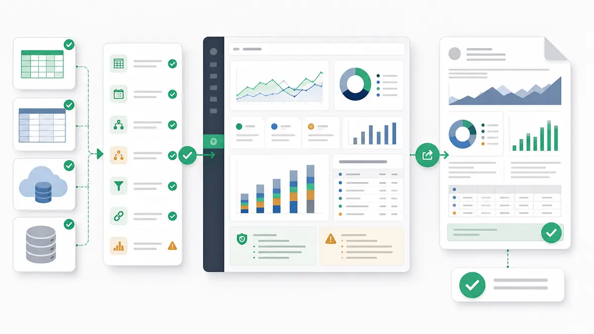
The alternative is Anomaly AI — connect BigQuery, Excel, Google Sheets, GA4, MySQL, and other database workflows, then turn plain-English requests into dashboards, reports, PDFs, slides, docs, and scheduled updates. Instead of pre-building every chart a stakeholder might want, you expose the data once and let users ask for the business output they need with traceable logic behind it.
The practical split looks like this: use the BigQuery or Snowflake dashboard stack for the handful of high-traffic, executive-facing dashboards that really do need pixel-perfect polish and governed metrics. Use Anomaly AI as the analysis layer for everything else — the ad-hoc questions, the one-off investigations, the "can you pull this by next Tuesday" requests that clog the data team's queue. For many teams, that second bucket is where most of the actual business value lives, and collapsing it into a conversational SQL-transparent tool is faster than building another dashboard project nobody will maintain.
Real-Time Dashboard Architecture
BigQuery Real-Time Streaming
For dashboards requiring sub-minute data freshness, use BigQuery's Storage Write API with 1-5 second end-to-end latency.
Real-Time Dashboard Use Cases:
- IoT Monitoring: Device telemetry, sensor data, fleet tracking
- E-Commerce: Live sales, inventory levels, website traffic
- Financial Services: Trading dashboards, fraud detection, risk monitoring
- Operations: Manufacturing KPIs, supply chain visibility, logistics tracking
Snowflake Real-Time Streaming
Snowflake's Snowpipe Streaming enables continuous, low-latency data ingestion with 5-15 second latency.
Choosing Between BigQuery and Snowflake for Dashboards
| Criteria |
BigQuery |
Snowflake |
| Query Performance |
Better for: Large scans, window functions, time-series |
Better for: Complex joins, semi-structured data, high concurrency |
| Dashboard Tools |
Looker Studio (free), Looker, Tableau, Power BI |
Streamlit (native), Tableau, Power BI, Looker |
| Real-Time Latency |
1-5 seconds (Storage Write API) |
5-15 seconds (Snowpipe Streaming) |
| Cost Model |
Pay per query (per TB scanned), BI Engine reservation ($40/GB/month) |
Pay per warehouse hour ($2-32/hour), auto-suspend minimizes costs |
| Concurrency |
12-18% degradation at 100 users (auto-scales) |
Consistent performance with multi-cluster (up to 100+ users) |
| Setup Complexity |
Low - serverless, no infrastructure |
Medium - warehouse sizing, clustering configuration |
| Best For |
Google Cloud shops, cost-sensitive, large scans, ML integration |
Multi-cloud, high concurrency, complex queries, Python dashboards |
Real-World Dashboard Implementation: Case Studies
Case Study 1: E-Commerce Real-Time Sales Dashboard (BigQuery)
Challenge: Online retailer needed real-time visibility into sales, inventory, and website performance across 500+ stores.
Solution:
- Streaming ingestion via BigQuery Storage Write API (5-second latency)
- Materialized views for pre-aggregated store/product metrics
- Looker Studio dashboards with BI Engine acceleration
- Mobile-optimized views for store managers
Hypothetical outcomes:
- Dashboard load time drops from several seconds to sub-second once BI Engine caches the hot dimensions
- Query cost falls sharply as materialized views and caching replace repeated full-table scans
- User adoption rises when dashboards respond fast enough to support live decision-making instead of being treated as weekly reports
Case Study 2: Financial Services Risk Dashboard (Snowflake) — Hypothetical
Illustrative pattern, not a specific customer engagement.
Challenge: A bank needs to combine structured transaction data with semi-structured fraud signals from many sources for real-time risk monitoring.
Solution pattern:
- Snowflake multi-cluster warehouse sized for concurrent analyst access
- Native Streamlit app for custom risk visualizations with Python ML models
- Search optimization on customer IDs and transaction IDs
- Row-level security for regional compliance teams
What this pattern tends to unlock:
- Higher concurrent-user capacity without the single-warehouse contention seen under heavy load
- Faster fraud detection cycles once search-optimized lookups replace scans across large transaction tables
- Shorter development time for new dashboards when Streamlit is already wired into the warehouse
Getting Started: Your Dashboard Roadmap
Week 1: Foundation Setup
- Set up BigQuery project or Snowflake account
- Load sample data or connect to existing data sources
- Create partitioned/clustered tables optimized for dashboard queries
- Configure warehouse (Snowflake) or enable BI Engine (BigQuery)
Week 2: Build First Dashboard
- Select dashboard tool (Looker Studio for BigQuery, Streamlit for Snowflake recommended for beginners)
- Create 3-5 core visualizations (revenue trend, top products, regional breakdown)
- Add interactive filters (date range, region, product category)
- Test performance with expected user load
Week 3: Optimize and Scale
- Implement materialized views or aggregate tables
- Configure caching and result reuse
- Add row-level security for multi-tenant access
- Set up cost monitoring and resource limits
Week 4: Production Launch
- Conduct user acceptance testing with 10-20 pilot users
- Create documentation and training materials
- Set up alerting for dashboard failures or performance issues
- Launch to full user base with support plan
Next Steps: Building Enterprise-Grade Dashboards
You now have a comprehensive foundation for building production dashboards on BigQuery and Snowflake. To accelerate your dashboard development:
Ready to build intelligent dashboards that automatically surface insights? Try Anomaly AI - our platform combines BigQuery/Snowflake integration with AI-powered analytics to help you build smarter dashboards faster.
Related Reading: