
Create a refreshable monthly dashboard from Excel data
Every month you get a new Excel export of the same business data, and every month you rebuild the same totals and charts. Build the dashboard once, check the numbers against the file, and next month just drop in the new export — the dashboard reads the new period.
Beginner·5 steps
Before you begin
- — An Excel workbook or export of your monthly business data (.xlsx or .csv).
- — A monthly export that keeps the same columns each period — that consistency is what makes the dashboard reusable.
- — An Anomaly account. Uploading and re-uploading your Excel file don’t use credits; building the dashboard and generating an AI-authored report do, and exporting the dashboard to PDF is a one-click, no-credit action (see pricing).
This is a supported, current-product workflow: you upload a file and Anomaly builds and exports the report, and you re-upload to refresh it. It is not a live connection, automatic sync, or real-time monitoring.
The product screenshots below use synthetic example data to show the workflow. They are not customer results or performance benchmarks.
Start with this month’s Excel export
Create a project and upload the month’s workbook — drag it in or browse to the .xlsx (uploads are supported up to 1GB). Anomaly reads the file directly: it detects the header row, parses the dates, and recognizes the numeric columns, then loads every row as a table. You do not need to reshape the file first.
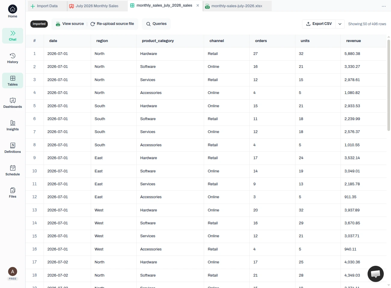
Result — Every row from the workbook is loaded — here, 496 rows across date, region, product_category, channel, orders, units, and revenue, with dates parsed and amounts read as numbers. These are the columns your dashboard will read, so keep next month’s export in the same shape.
Tip — What makes the dashboard reusable is a monthly export that keeps the same columns in the same order and keeps each column meaning the same thing in the same form — dates still dates, amounts still numbers. Matching header names alone is not the boundary: if next month’s file reuses a name but the values underneath change type or meaning, Anomaly asks you to review the replacement instead of loading it silently.
Build the monthly dashboard once
In the chat, describe the monthly view you want. Anomaly profiles the data, writes the SQL behind the tiles it builds, picks chart types, and assembles a multi-tile dashboard — the analysis you would otherwise rebuild by hand every period.
Build a monthly sales dashboard from the monthly_sales_july_2026_sales table: total revenue, total orders, and total units as KPI cards; revenue by region as a bar chart; revenue by product category as a bar chart; and daily revenue as a line chart.
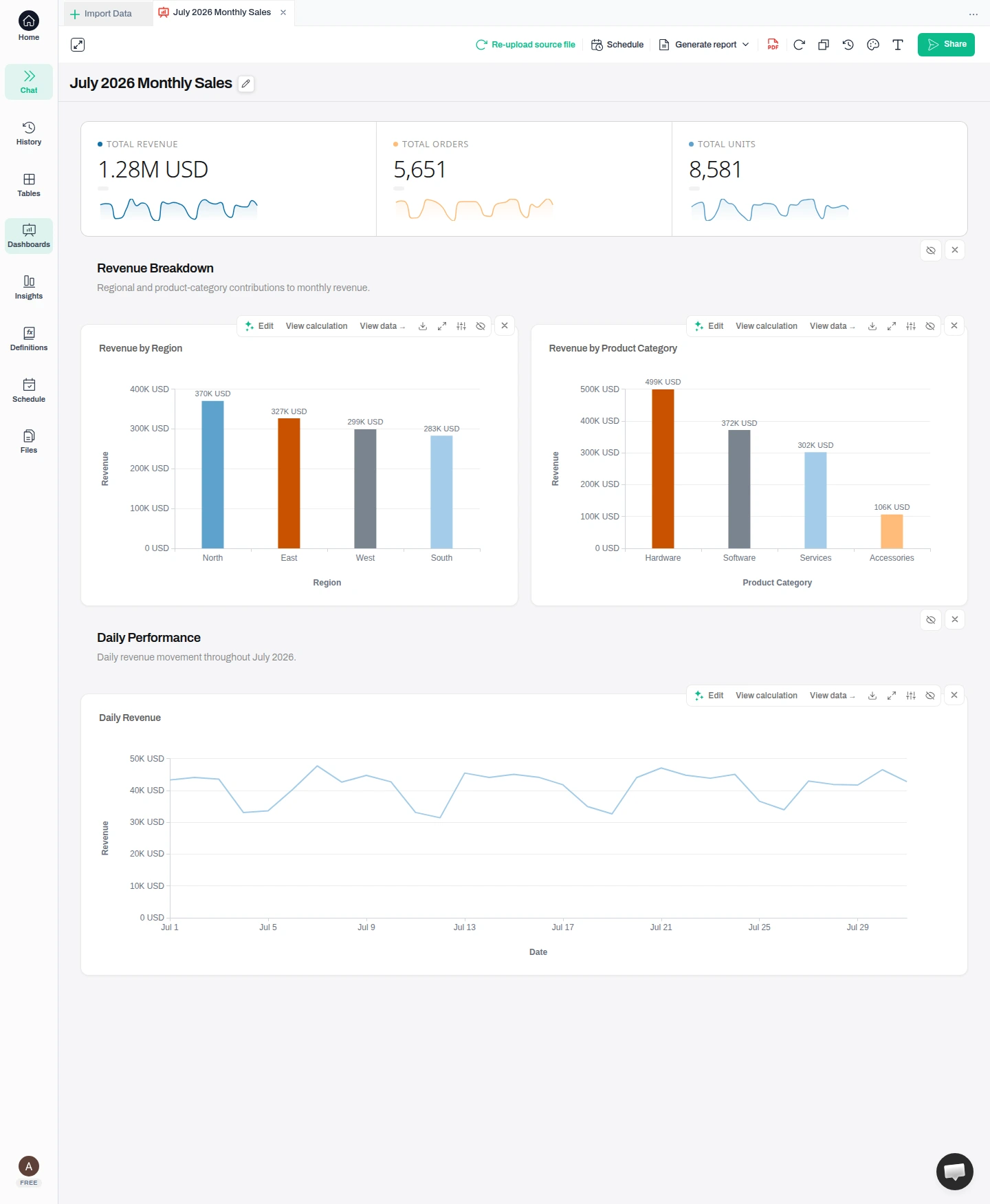
Result — One request produces the full monthly view — Total Revenue 1.28M, Total Orders 5,651 and Total Units 8,581, plus the regional, category, and daily breakdowns — all built from your uploaded rows.
Warning — The screenshots label these totals “USD”, but nothing in this workbook or the request above established that. The file carries a plain revenue column with no currency field, and the prompt never names one — so the currency is a display label, not something read from your rows. Say which currency your amounts are in when you ask for the dashboard, and confirm it against your source system before you rely on the numbers or share them.
Check the numbers against your file
Before this becomes a report anyone relies on, confirm the totals. On the Revenue by Region chart, open “View calculation” to read the exact SQL behind the number (other tiles offer it where a calculation is available), then open “View data” to see the figures it produced.
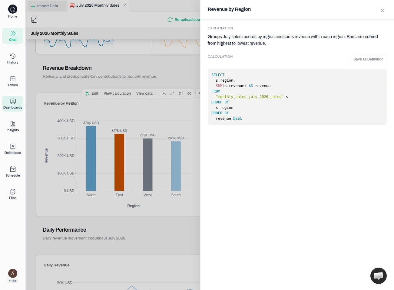
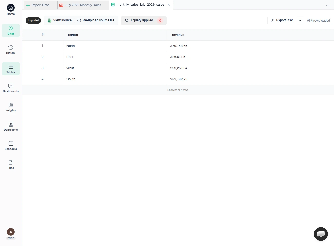
Result — The chart is “sum of revenue grouped by region” — no hidden logic. The rows behind it read North 370,158.65, East 326,611.5, West 299,251.04 and South 283,182.25, which add up to 1,279,203.44 — the same as the Total Revenue card (1.28M) and the same as the Revenue column total in the workbook. That is the reconciliation to do before anyone relies on the numbers.
Warning — A number can look finished and still be wrong. Reconcile at least one headline figure to its rows before the dashboard leaves your hands — especially if your export includes a summary or totals row, which you should remove so it cannot double-count.
Next month, refresh it with the new file
This is the payoff. When next month’s export arrives with the same columns in the same order, holding the same kind of values, use “Re-upload source file” and choose the new file. Anomaly confirms what will be refreshed, replaces the data behind the same table, and reports “Updated 1 table.” Reopen the dashboard and the tiles read the new month — you do not rebuild the charts, formulas, or layout. That is what happened in the run below.
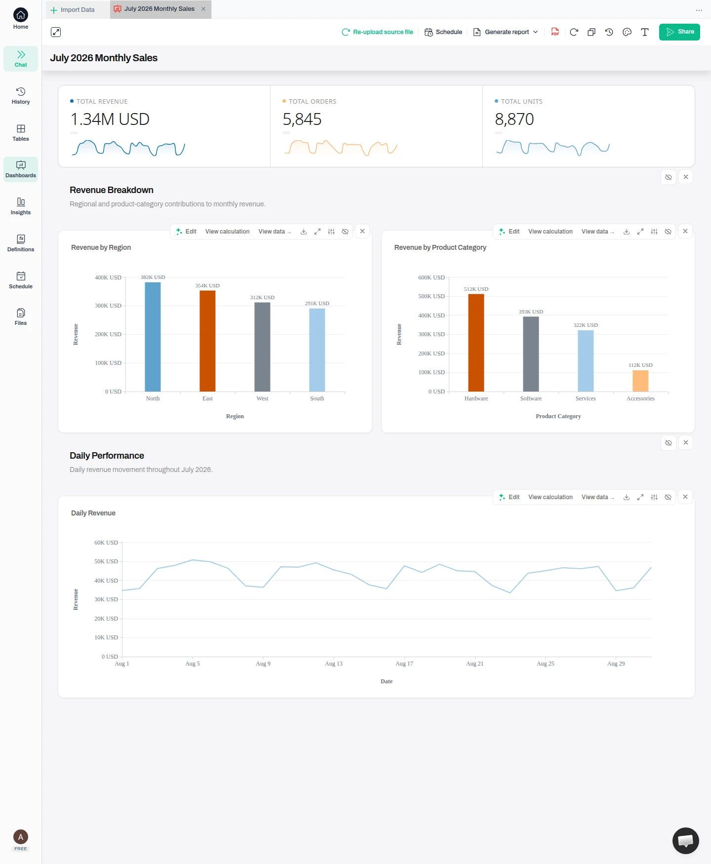
Result — Same dashboard, new month. Total Revenue moved from 1,279,203.44 to 1,338,742.27, Orders from 5,651 to 5,845 and Units from 8,581 to 8,870; the regional bars and the daily line now run across August instead of July. Every figure matches the August workbook. Give the refreshed totals the same reconciliation from Step 3 before you share them.
Tip — The data refreshes, but the names you gave things do not. The dashboard title and any titles written when you built it still say “July” until you rename them — click the title to edit it after a refresh.
Warning — This is a manual re-upload, not a live or automatic sync: the dashboard shows the data you last uploaded until you re-upload the next file. A clean swap needs more than matching header names — keep the same columns in the same order, each still carrying the same kind of value it carried before. If the new file cannot be read the way the saved table expects — a date arriving as text, an amount that no longer converts to a number — Anomaly stops and opens its review path with a “Fix” step rather than loading data that would break your tiles.
Share the refreshed dashboard
When the month’s numbers are right, use “Share” to create a link and send the dashboard outside your workspace. That is the finish this tutorial verified.

Result — The month’s dashboard leaves as a link, and next month the same link shows the refreshed numbers once you re-upload.
Tip — Prefer a file? “Export PDF” saves the current dashboard as a PDF in one click.
FAQ
Do I have to rebuild the dashboard every month?
No — that is the point. You build it once from the first month’s file. When the next month’s export arrives, you use “Re-upload source file” on the table to swap in the new data, and the same dashboard reads the new period. Keep each month’s export in the same shape for that to stay true: the same columns in the same order, with each column still holding the same kind of value. If a replacement cannot be read the way the saved table expects, Anomaly opens a review with a “Fix” step instead of loading it.
Does the dashboard update automatically when new data arrives?
For a dashboard built from an uploaded Excel file, refreshing is a manual re-upload: the dashboard shows the data you last uploaded until you upload the next file. It is not a live connection or an automatic sync. You can schedule a recurring email report (daily, weekly, or monthly), but for an uploaded-file dashboard it emails the data you last uploaded until you re-upload — and scheduled runs use credits.
How do I know the totals are right?
Open “View calculation” on a tile to read the exact SQL behind the number, and “View data” to see the figures it produced. Reconcile a headline figure such as Total Revenue to the sum of that column in your workbook — in this tutorial the four regional figures add up to 1,279,203.44, matching both the Total Revenue card and the workbook. If your export has a grand-total or summary row, delete it first so it cannot be counted twice.
What if next month’s file has different columns?
The dashboard reads columns by name, so a monthly export that keeps the same structure is what makes it reusable. If the columns change, Anomaly does not guess: it flags a “Schema changed” review and offers a “Fix” step for the affected tables and tiles. Column names are not the only thing checked, though — a file whose names all match can still fail if its values no longer convert the way the saved table expects, and that lands in the same review with a “Fix” step. Keeping your monthly export consistent in both structure and content is the simplest way to avoid it.
Does the dashboard rename itself for the new month?
No. The data refreshes, but names do not. The dashboard title and any titles written when you built it keep the month you first used — click the title to rename it after a refresh.
What's next
- — Keep next month’s export in the same shape, so the refresh is a re-upload instead of a rebuild.
- — Reconcile a headline figure after every refresh, using “View calculation” and “View data” where a tile offers them.
Ready to Try AI Data Analysis?
Experience AI-driven data analysis with your own spreadsheets and datasets. Generate insights and dashboards in minutes with our AI data analyst.