
Create a traceable finance report from transaction data
You have an export of finance transactions — hundreds or thousands of rows — and a stakeholder who wants the totals, trends, or exceptions summarized. The moment you put a figure in front of them, someone asks, “Where did this number come from?” This tutorial builds a finance summary you can back with evidence — the calculation and source rows behind a number, and an expense category that opens to its individual transactions.
Beginner·5 steps
Before you begin
- — A CSV or Excel export of finance transactions (.csv or .xlsx) with, at minimum, a date, an amount, and a column that separates money in from money out. A category column adds the expense breakdown.
- — A reporting question a stakeholder has asked — a total, a trend, or where the money went.
- — An Anomaly account. Uploading your file doesn’t use credits; building the summary does, and exporting the report to PDF is a one-click, no-credit action (see pricing).
A note on what this is and isn’t: Anomaly summarizes the transactions file you upload and lets you inspect the calculation and source rows behind its numbers, with expense categories that open to their individual transactions. It is not an accounting-system integration, it does not automatically reconcile between systems, and it is not an audit or compliance certification. It makes a report you can defend, not a substitute for your accounting process.
The product screenshots below use a synthetic transaction dataset to show the workflow. They are not customer data or financial results.
Start with your transactions export
Create a project and upload the transactions file — drag it in or browse to the .csv or .xlsx (uploads are supported up to 1GB). Anomaly reads the file directly: it detects the header row, parses the dates, and recognizes the amount column as numeric, then loads every transaction as a table. You do not need to summarize or reshape the file first.
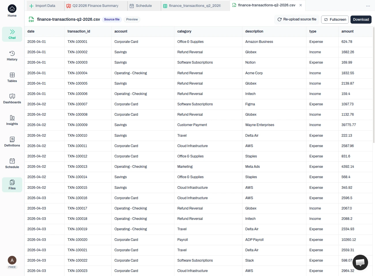
Result — Every transaction is loaded — here, 558 rows across date, transaction_id, account, category, description, type, and amount. Those columns are the source rows the report calculates from and that you reconcile against.
Tip — You need at least a date, an amount, and a column that separates money in from money out — in this file, a “type” of Income or Expense. A category column is what makes the expense breakdown possible.
Turn the transactions into a finance summary
In the chat, describe the summary a stakeholder needs — and state the currency your amounts are in, because a plain transactions export usually does not carry one. Anomaly profiles the data, writes the SQL behind the calculated tiles it builds, runs a few data-quality checks (duplicate transaction IDs, null or negative amounts, invalid types), and assembles a multi-tile summary — the report you would otherwise build by hand.
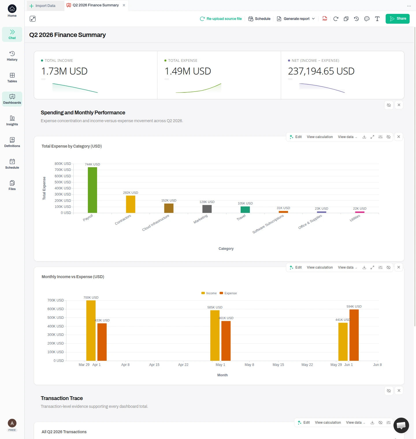
Use the finance_transactions_q2_2026 table, which holds Q2 2026 finance transactions where all amounts are in USD. Build a finance summary dashboard: total income, total expense, and net (income minus expense) as KPI cards; total expense by category as a bar chart; and monthly income vs expense as a chart. Label every total in USD and keep every number traceable to the underlying transactions.
Result — One request produces the finance summary — total income, total expense, and net as headline figures, plus where the money went (expense by category) and how income and expense moved month to month. The totals are labeled in USD because you supplied that in the request, and the report also builds a Transaction Trace of the underlying rows. This is the report; the rest of the tutorial is about being able to trust and defend it.
Tip — Currency is not something to leave to a guess. Your export usually does not state one, so name it in your request (here, “all amounts are in USD”). Then the totals are labeled from a fact you gave, not one the tool inferred.
Reconcile a number to your file
Before anyone relies on the report, confirm a figure against your file. On the expense-by-category chart, open “View calculation” to read the exact SQL Anomaly used (other tiles offer it where a calculation is available). Here it sums the amount column where the type is Expense, grouped by category — check that against your own file.
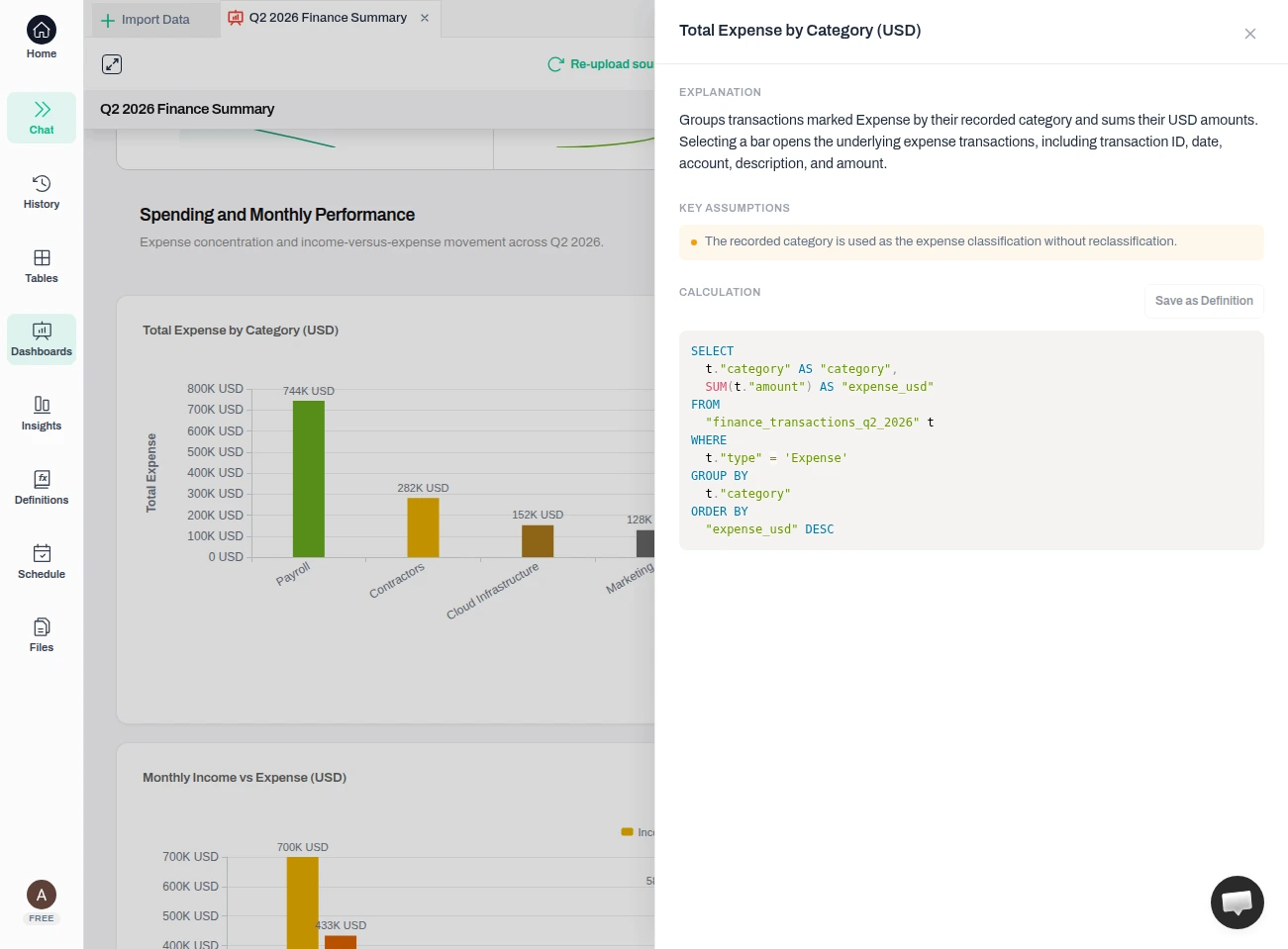
Result — The expense breakdown is “sum of amount where type = Expense, grouped by category” — no hidden logic. The panel names its key assumption in plain language — that the recorded category is used as the expense classification, without reclassification — so you can see exactly what the number counts. Because the SQL filters to Expense rows, income is not included in the breakdown.
Warning — A number can look finished and still be wrong. Reconcile at least one headline figure to its rows before the report leaves your hands — and if your export includes a grand-total or summary row, remove it so it cannot be counted twice. In this example the net (237,194.65) is total income minus total expense; confirm the same against your own file.
Open the transactions behind a number
This is the answer to “where did this number come from?”. Select the Payroll bar in the expense chart. Anomaly opens the individual transactions that make up that bar — the same rows you uploaded, with transaction ID, date, account, description, type, and USD amount.
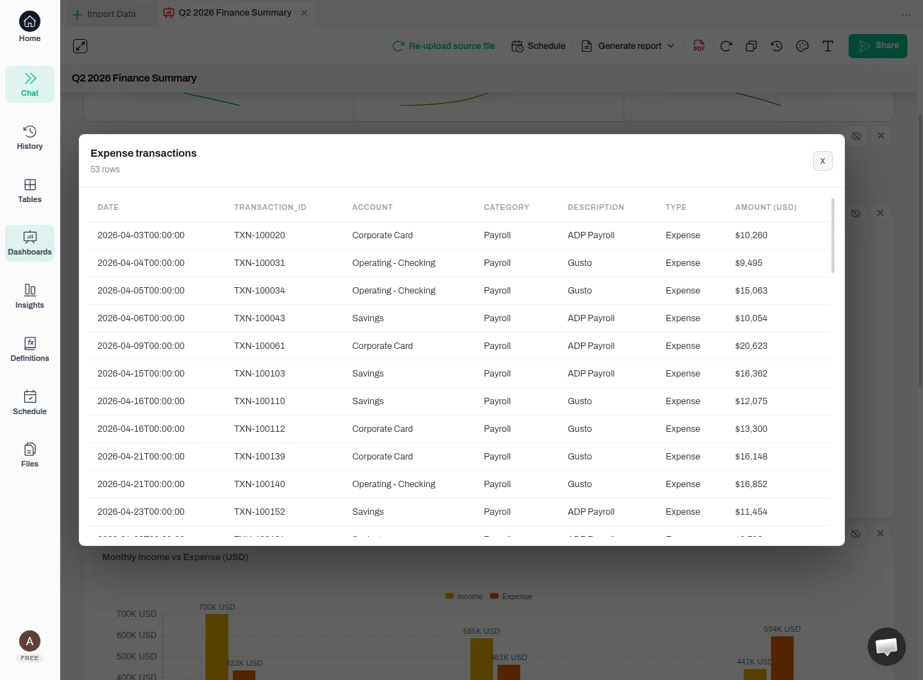
Result — Selecting Payroll opens its 53 expense transactions — each with its ID, date, account, description, and USD amount — the individual rows that add up to that bar. These are three separate evidence surfaces: selecting an expense-category bar opens its contributing rows, “View data” shows the grouped category totals, and the Transaction Trace keeps the full list of source rows.
Tip — Reconcile against these rows yourself before you rely on the number: the report surfaces the transactions and the formula, it does not certify that the figure is correct for your business.
Send the report — and still be able to defend it
When the summary is right, use “Share” to create a link and send the report outside your workspace. That is the finish this tutorial verified.
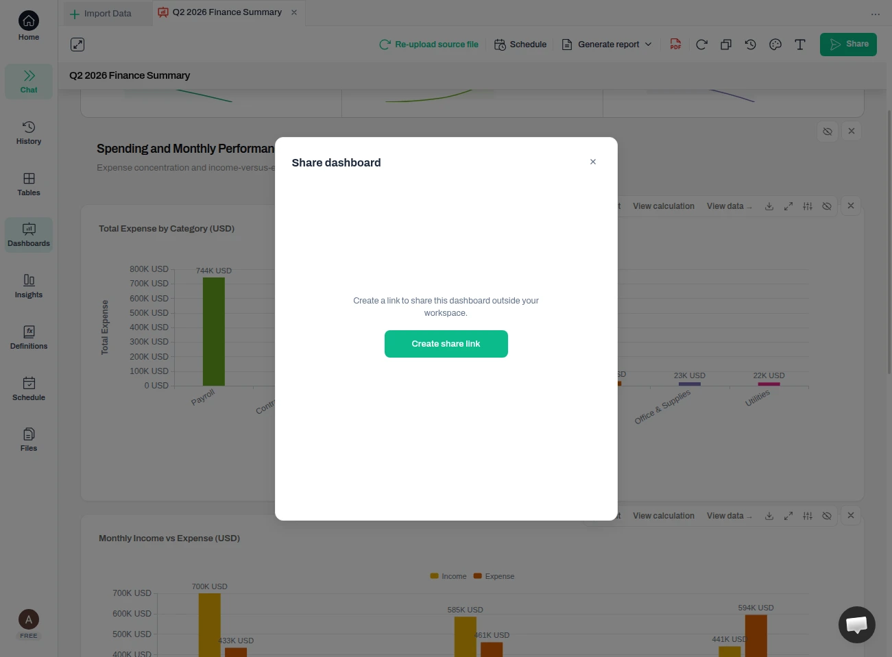
Result — The report leaves as a link. It carries its calculation and source evidence — including the expense-category drill that opens the contributing transactions — so you can still answer “where did this come from?” after you have sent it.
Tip — Prefer a file? “Export PDF” saves the current report as a PDF in one click.
FAQ
How do I answer “where did this number come from?”
Select an expense-category bar — for example the Payroll bar — and Anomaly opens the individual transactions that make it up. Where a tile offers it, you can also open “View calculation” for the exact SQL behind that number and “View data” for the totals it produced, and the report keeps a full Transaction Trace of the source rows. Reconcile a figure such as total expense against those transactions and the formula. The point of this workflow is that the report stays explainable with reviewable evidence.
Does Anomaly connect to my accounting system, like QuickBooks or Xero?
No. This workflow summarizes a transactions file that you export and upload. It does not connect to or post entries into an accounting system, and it does not perform automatic reconciliation between systems. What it does is make the file’s totals explainable back to the individual transactions.
Is this an audit or compliance tool?
No. It is a way to build a report from your transaction data and keep it backed by reviewable evidence — the calculation behind a number, and an expense category that opens to its contributing transactions. Use your own accounting and audit processes for compliance; this simply helps you show the evidence behind a figure when someone asks.
What columns does my export need?
At least a date, an amount, and a column that separates money in from money out (in the example, a “type” of Income or Expense). A category column lets Anomaly break expenses down by category. If your export has a grand-total or summary row, remove it first so it is not counted twice.
What currency does the report use?
Whatever currency you tell it. A plain transactions export usually does not carry a currency, so state it in your request — for example, “all amounts are in USD.” In this tutorial that is exactly what we did, and the totals are labeled USD as a result. Naming the currency yourself keeps the label grounded in a fact you supplied instead of one the tool had to assume.
What's next
- — Reconcile at least one headline total to its transactions before the report leaves your hands.
- — When an expense category is questioned, select its bar to open the underlying transactions, or open “View calculation” where available for the formula.
Ready to Try AI Data Analysis?
Experience AI-driven data analysis with your own spreadsheets and datasets. Generate insights and dashboards in minutes with our AI data analyst.