
Marketing Analytics
9 min
How to Explain a Sudden CAC Spike to Your Board
A board-safe CAC spike framework for separating timing noise from real acquisition issues, proving the driver, and showing the recovery metric.
Read More


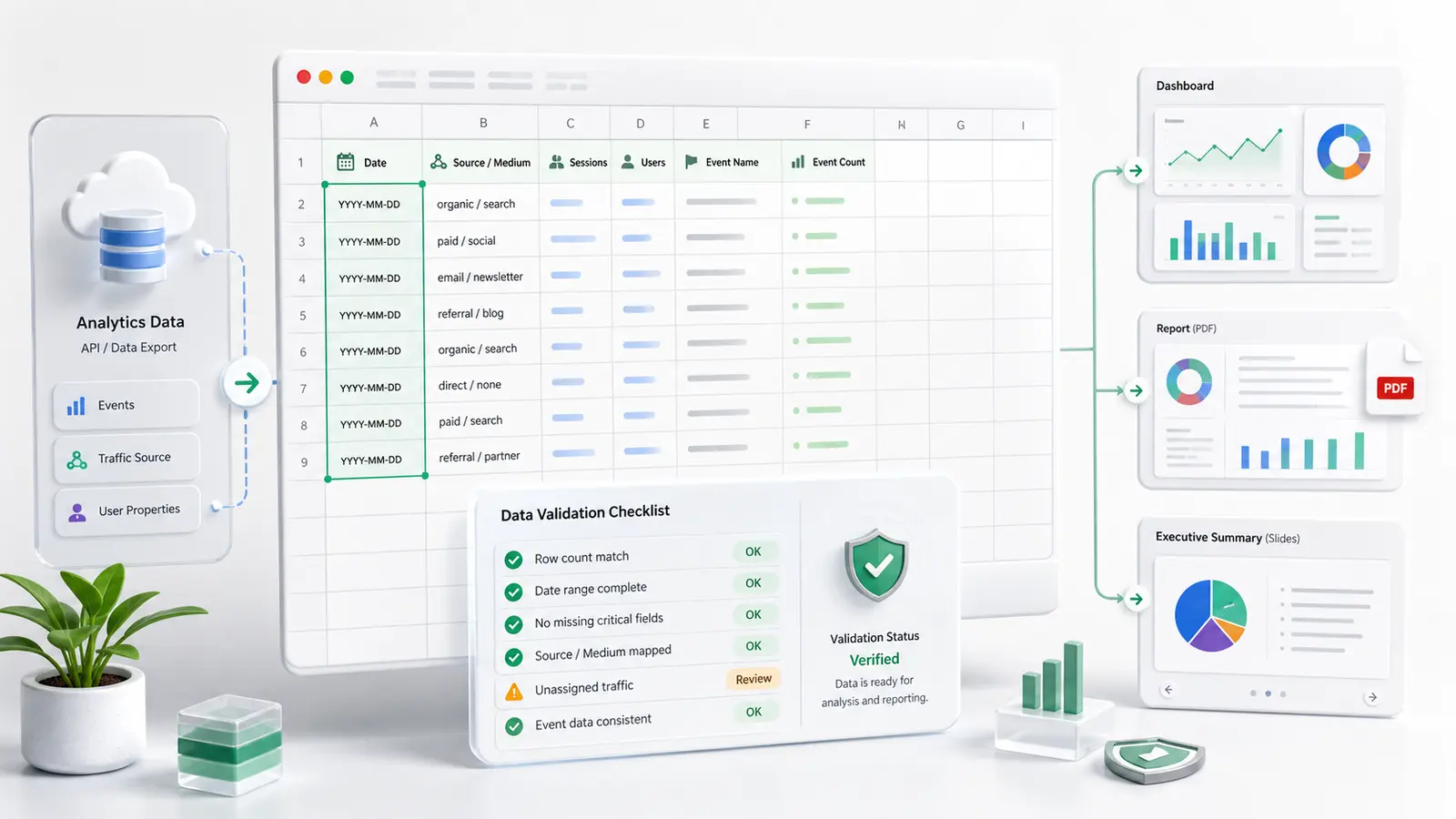
Quick answer — generate QBR PPT slides from BigQuery data
To generate client-ready QBR PPT slides from BigQuery data, start with the QBR question, lock metric definitions and date windows, query the source tables, build a slide-by-slide narrative with evidence and caveats, review every calculation, and only then export the story into PowerPoint. The goal is a defensible client narrative, not an unreviewed chart dump.
Quarterly business reviews are critical touchpoints for agencies, consultants, and operations teams. But when the deadline is close, the pressure to deliver can push teams toward the weakest version of reporting: pull a few warehouse charts, paste them into a deck, add a polite summary, and hope nobody asks how the number was calculated.
That is not a client-ready QBR. It is a screenshot collection.
To generate QBR PPT slides from BigQuery data that a client can actually trust, you need to turn source-backed analysis into a narrative your team can defend. The deck should show what changed, why it matters, what evidence supports the read, what remains uncertain, and what action comes next.
The most common mistake in last-minute QBR prep is starting with visual design. You open the slide template, look for empty chart slots, and start filling boxes.
That usually creates a chart dump, not a business review.
The failure mode is predictable:
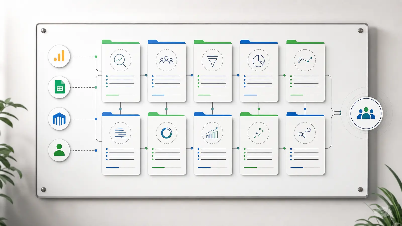
A client-ready QBR deck does not need every chart. It needs a clean operating story:
That sequence matters more than the chart type.
BigQuery gives you a strong source layer for this work. Google describes BigQuery as a fully managed, AI-ready data platform for managing and analyzing data, with a serverless architecture that supports SQL and Python without infrastructure management. The BigQuery documentation hub also frames it as a fully managed, petabyte-scale analytics data warehouse for running analytics over large datasets.
That is useful. It does not replace judgment.
Before you query anything, lock the story shape:
This is where many last-minute decks go wrong. BigQuery can return the data. It will not decide which story is safe to tell the client.
If you need a prompt-first way to prepare those questions before a meeting, use the pre-meeting marketing analytics prompts as a starting point.
Once the story is clear, run the checks that keep the deck defensible. These belong inside the analysis workflow before anything becomes a PowerPoint slide.
For a BigQuery analysis workflow, review:
That last point is not cosmetic. Google's BigQuery SQL introduction says GoogleSQL is the recommended dialect for new BigQuery projects and supports statements for creating, modifying, querying, and managing data. Whether the query is written by a person or generated from a plain-English request, the logic still needs to be verifiable.
If your QBR uses GA4 export tables, the same principle applies. You can query GA4 BigQuery export data without hand-writing SQL, but you still need to inspect the generated logic before the result becomes a client-facing claim.
Use this matrix to turn BigQuery-backed analysis into a QBR narrative. The goal is not to fill every slide. The goal is to make each slide earn its place.
| Slide | Question answered | BigQuery data needed | Evidence or caveat to review | Client-safe wording |
|---|---|---|---|---|
| Executive summary | What is the overall performance story? | High-level QBR KPIs across the approved reporting period | Confirm date windows match exactly; note any incomplete periods | "Overall performance improved in the areas that matter most, with the strongest movement concentrated in the segments shown below." |
| KPI movement | How did core metrics move compared with the comparison period? | Period-over-period KPI table with metric definitions | Check that each metric uses the same denominator and period logic | "The primary KPI moved in the right direction, and the calculation uses the same definition across both periods." |
| Segment, channel, or customer driver | Which area explains most of the movement? | Segment, channel, campaign, customer, region, or cohort tables | Low-volume segments can exaggerate percentage changes | "The movement is concentrated in this segment, so the next step is focused there rather than across the entire account." |
| Funnel or conversion movement | Where did the path improve or weaken? | Funnel stage counts, conversion rates, and stage definitions | Verify that stage order, user/customer IDs, and denominators are consistent | "The biggest change appears at this step in the funnel, based on the same stage definition across both periods." |
| Retention, revenue, or customer quality | Did the period create better or worse customers? | Cohort, revenue, retention, renewal, or customer-quality tables | Recent cohorts may need more time before the quality read is stable | "The quality signal is directionally useful, but the newest cohort should be reviewed again after more data matures." |
| Root-cause hypothesis | What is the strongest explanation for the movement? | Deep-dive query outputs by date, segment, source, campaign, or operational event | Do not present a guaranteed root cause; separate evidence from hypothesis | "The leading hypothesis is this driver, based on the pattern in the source data. We are not treating it as final until the remaining caveats are cleared." |
| Action plan | What should happen next? | Recommendation table, owner, expected metric, and review date | Every action should tie back to a verified finding | "The next action is tied to the affected segment and will be judged by this recovery metric." |
| Appendix and source logic | How can the client or team verify the claims? | SQL logic, source table names, metric definitions, assumptions, and reconciliation notes | Make sure the appendix is readable enough to support the meeting | "The appendix documents source tables, metric definitions, and query logic for review." |
This is the difference between "here are the charts" and "here is the QBR story we can defend."
Most last-minute QBRs fail because technical evidence and executive narrative get mixed together. The main deck becomes too dense, while the logic still is not clear enough to review.
Put this on the slide:
Put this in the appendix:
This separation lets the QBR stay readable while keeping the evidence available. Microsoft's PowerPoint file-format documentation lists standard .pptx presentations and PDF documents among supported formats, so teams can share the working deck, a locked PDF, or both depending on the client workflow.
Run this checklist before the deck leaves your team.
For board-facing metrics such as acquisition cost, the same review discipline applies. A board-safe CAC spike explanation should define the formula, driver, evidence, uncertainty, action, and recovery metric before it becomes a slide.
Anomaly AI is an AI data analyst for turning connected business data into usable stakeholder reporting workflows: interactive dashboards, business reports, source-backed summaries, and client-ready QBR materials.
For a BigQuery-backed QBR, that means the workflow can look like this:
That last word matters: reviewed. Anomaly can help you move from BigQuery data to a client-ready deck faster, but the deck is only client-ready when the logic, caveats, and story have been checked by a human who understands the account.
You can also review available data source workflows if your QBR needs more than BigQuery data.
Ready to turn source-backed analysis into a better reporting workflow? Try Anomaly AI.
Yes, if you treat BigQuery as the source layer and build a reviewed narrative from it. Query the relevant BigQuery tables, define the QBR period and metrics, map each finding to a slide, review the logic, and then turn the approved analysis into PowerPoint slides.
It should include an executive summary, KPI movement, segment or channel drivers, funnel or conversion movement where relevant, retention or revenue quality if applicable, a clearly labeled hypothesis section, an action plan, and an appendix with source logic and metric definitions.
Not necessarily. You can use a workspace like Anomaly to ask plain-English questions and inspect generated BigQuery logic. The important requirement is not hand-writing SQL; it is keeping the query logic inspectable before the answer becomes a client-facing slide.
Keep query logic, source table names, metric definitions, segmentation rules, reconciliation notes, low-volume caveats, and raw row examples in the appendix. The main slides should focus on the decision, the evidence, the caveat that affects interpretation, and the next action.
Yes. Anomaly supports BigQuery as a source workflow and can turn reviewed, source-backed analysis into QBR slides alongside dashboards, refreshable reports, and scheduled reporting workflows. The final deck should still be reviewed before it is sent to a client.
Experience AI-driven data analysis with your own spreadsheets and datasets. Generate insights and dashboards in minutes with our AI data analyst.
Founder, Anomaly AI (ex-CTO & Head of Engineering)
Abhinav Pandey is the founder of Anomaly AI, an AI data analysis platform built for large, messy datasets. Before Anomaly, he led engineering teams as CTO and Head of Engineering.
Continue exploring AI data analysis with these related insights and guides.
A board-safe CAC spike framework for separating timing noise from real acquisition issues, proving the driver, and showing the recovery metric.
A source-backed prompt library for client meetings: 10 prompts to verify traffic, CAC, cohorts, attribution, and next steps before you present.
A safer GA4-to-Excel workflow for choosing the right export path, preserving scope, reconciling totals, and producing verifiable reports.