School operators, education analysts, and district data teams rarely get one clean student-performance dataset. The reality is messier: SIS exports, teacher gradebooks, attendance files, assessment files, intervention logs, enrollment tables, cohort lookups, and manual spreadsheets all hold part of the story. A school management dashboard can make that landscape easier to inspect, but only if it is built as a review tool rather than a real-time tracking system, prediction engine, compliance shortcut, or replacement for the SIS.
Quick answer — school management dashboard for student performance
To build a school management dashboard across messy datasets, inventory each source, map stable student/cohort IDs, define attendance and performance metrics, check missing and duplicate records, aggregate sensitive data carefully, then publish sections for attendance, assessment, cohort performance, interventions, missing data, and leadership review. Treat the dashboard as a review tool, not a real-time monitor, prediction engine, compliance shortcut, or SIS replacement.
The hard part is not making a chart. The hard part is making a chart that a principal, district leader, program owner, or analyst can question without the whole thing falling apart. The dashboard needs source inventory, join logic, metric definitions, caveats, and privacy review close to the output.
This guide walks through a practical workflow for building a student performance dashboard from messy school datasets, including what to define first, which files to inventory, how to structure the dashboard, where privacy caveats belong, and how Anomaly can help package the result as a verifiable dashboard or report.
Start With the School Question, Not the Chart
When designing a dashboard, it is tempting to start with the visual: a heatmap, trend line, scorecard, or distribution chart. That is backwards. Effective school data analysis starts with the question school leaders need to answer.
Define the boundaries before building:
- Leader question: What is the specific question the dashboard should help answer? For example: which cohorts need attendance review, which assessment groups need instructional support, or which intervention follow-ups need source-record review?
- Bounded audience: Who will consume this view? A principal, grade-level team, district leader, program owner, and analyst usually need different levels of detail.
- Decision/use case: What action or discussion should follow the review? If a metric does not inform instructional review, resource planning, intervention follow-up, or data cleanup, it may not belong on the first screen.
- Date window: Is the dashboard showing a completed term, current reporting period, weekly export, or historical comparison? Label the window clearly so readers do not assume the dashboard is live.
- Cohort or group: Which student population is included? Use locally approved grade, cohort, program, or school-year definitions.
- Review cadence: How often will leadership inspect the dashboard? Weekly school review and quarterly district review need different grains and caveats.
The IES/WWC practice guide on using student achievement data frames student achievement data as part of an ongoing instructional improvement cycle, supported by a clear vision, staff support, and a districtwide data system. That is the right mental model for a dashboard. It should not be a one-off wall of metrics. It should support repeatable inquiry.
The 2026 IES REL discussion of dashboard feedback also emphasizes that dashboards can help leaders understand which student groups may need support and should improve through structured feedback. The goal is shared understanding and action, not automatic answers.
Inventory the Messy Student Datasets Before You Join Them
Before merging files, inventory the source data. Student data is often siloed, and each file has its own structure, update frequency, owner, and caveats. If the dashboard hides that complexity, leadership may trust a polished view more than the source data supports.
Common school datasets include:
- SIS exports: enrollment status, grade level, school, student ID, entry and exit dates, and authorized program or cohort fields.
- Attendance files: daily or period attendance, absence codes, tardies, excused/unexcused distinctions, and reporting periods.
- Assessment files: standardized tests, benchmark assessments, classroom assessments, subject fields, score fields, and test windows.
- Gradebooks: course-level grades, marking periods, assignment completion, missing assignments, and current grade status.
- Enrollment and cohort tables: historical rosters, grade-band groupings, graduation cohorts, and midyear movement.
- Intervention logs: intervention type, start date, follow-up status, staff owner, and next review date.
- Program participation files: program membership, eligibility flags where authorized, and start/end dates.
- Manual spreadsheets: staff-maintained exception trackers, temporary lists, data corrections, and local notes.
The NCES Forum Guide to Building a Culture of Quality Data says quality data are integral to teaching, learning, and managing the school enterprise. It also stresses that data quality improves when staff understand how the data will be used and get the data right at the source. That matters for dashboards: source inventory is not paperwork. It is the difference between a useful view and a misleading one.
For each file, ask three questions before joining it:
- What is the stable key? Prefer durable student IDs over names. If a file only has names, flag the match as weaker and review it before treating it as final.
- What is the time window? Attendance from the current month and assessment data from the prior term should not appear as if they share the same reporting period.
- What definition owns the metric? "Chronic absence," "proficiency," "intervention complete," and "current grade" need local definitions. If a definition is not confirmed, label the metric as provisional or exclude it.
If your school data starts in spreadsheets, build around the real source format instead of pretending it is already a governed warehouse. Anomaly supports Excel and CSV student-performance exports and Google Sheets analysis workflows, which makes it useful when the first job is turning operational files into a verifiable dashboard.
The same discipline also applies to repeatable dashboards from messy CSVs: intake, field mapping, definitions, review notes, and caveats come before the final view.
School Dashboard Planning Matrix
Use this planning matrix before building the dashboard. It maps each source to its join key, metric, dashboard section, risk, and review owner so the team knows what each number can and cannot support.
| Dataset |
Join key |
Metric |
Dashboard section |
Risk/caveat |
Review owner |
| Attendance export |
Student ID, date, school year |
Absence count, attendance rate, absence-code mix |
Attendance trends |
Missing dates, duplicate daily rows, or inconsistent codes can distort totals |
Attendance clerk or data lead |
| Assessment file |
Student ID, assessment window, subject |
Proficiency band, scale score, locally defined growth field where available |
Assessment distribution |
Test windows may not align with attendance or grade periods; small groups need careful aggregation |
Assessment coordinator |
| Gradebook export |
Student ID, course ID, marking period |
Current grade, missing assignments, credit status where supported |
Grade-band and course performance |
Gradebook timing and teacher updates may lag; current grade is not a final outcome |
Instructional lead |
| Enrollment/cohort table |
Student ID, enrollment status, grade band, cohort year |
Active enrollment count, cohort membership, subgroup rollup where authorized |
Cohort performance |
Midyear transfers and manual cohort labels can change denominators |
Registrar or SIS owner |
| Intervention follow-up |
Student ID, intervention ID, follow-up date |
Intervention start, status, next review, follow-up completion |
Intervention follow-up |
Missing notes can make follow-up look incomplete; status alone does not prove effectiveness |
Program owner |
| Missing data/quality |
Source file, row ID, student ID if authorized |
Duplicate rows, missing IDs, unmatched records, stale fields |
Data-quality exceptions |
Exception counts are not student performance metrics; they signal review work before action |
Data lead and privacy reviewer |
The matrix is intentionally operational. It is not trying to make every source perfect. It is trying to prevent a polished dashboard from laundering uncertain data into confident claims.
Build Dashboard Sections That Support Review
To make the dashboard useful, organize it into sections that support review. The NCES Forum Guide to Data Visualization says education visualizations should communicate data meaning in formats that are accessible, accurate, and actionable for education stakeholders. That is the bar: the dashboard should make the next review easier, not just make the data look finished.
Attendance trends
Show attendance rate, absence counts, and absence-code mix by time window, grade band, school, or cohort where appropriate. Keep the denominator visible. If the data excludes withdrawn students, late-entry students, or certain absence codes, say so near the section.
Assessment distribution
Show assessment performance by subject, test window, grade band, and cohort where the grouping is authorized and large enough to review responsibly. Avoid turning every distribution into a ranking. The dashboard should help teams ask which groups may need support, not create a simplistic scorecard.
Grade-band and cohort performance
Show current grade status, course completion, or proficiency bands by grade/cohort only when the underlying fields are defined. If current grades are incomplete or teacher updates lag the export, label that caveat. A dashboard can support instructional review, but it should not turn partial gradebook exports into final judgments.
Intervention follow-up
Show intervention start dates, follow-up status, review owner, and next review window. Do not use intervention status alone to claim that an intervention caused an outcome. It can show whether support processes are being logged and reviewed. It cannot, by itself, prove causal impact.
Missing and duplicate data
Do not hide this section. A dashboard that shows unmatched records, duplicate rows, missing IDs, stale dates, or incomplete cohort labels gives leaders a better read than one that quietly drops messy records. The point is not to blame the source system. The point is to show what needs review before the dashboard becomes decision evidence.
Leadership summary
End with a short, source-backed summary: what changed, where the evidence points, what caveat matters, and what action or review is recommended. Keep the language measured. "Review attendance records for the grade-band cohort before the support meeting" is stronger than a dramatic claim if the source file still has missing dates.
The IES REL dashboard-feedback guidance reinforces this point: dashboards should improve through structured user feedback so they spark inquiry and action. A dashboard should get clearer after leaders and data owners use it, find confusing sections, and tighten definitions.
Privacy and Compliance Caveats for Student Data
Student data is sensitive. A school management dashboard should be designed as if audience, access level, aggregation level, and output format all matter, because they do.
The U.S. Department of Education Student Privacy Policy Office has guidance on disclosure avoidance in aggregate reports, including strategies for protecting personally identifiable information from education records in reporting. Its privacy and data-sharing guidance also explains that FERPA generally restricts disclosure of personally identifiable information from education records without written consent, while certain exceptions and written agreements may apply under specific conditions.
This article is not legal advice, and a dashboard tool does not make a school compliant. Treat privacy and compliance review as a separate governance step with the right internal owner.
Use these practical caveats:
- Aggregate sensitive data carefully. Avoid exposing student-level records unless the audience is authorized for that level of detail.
- Watch small cells. Small cohorts can make students identifiable even when names are removed. Use aggregation and suppression rules approved by the school or district.
- Limit access by role. A leadership summary, teacher team view, and district board packet may need different levels of detail.
- Separate review notes from public outputs. Internal data-quality exceptions can be useful, but they may not belong in every exported report.
- Use written agreements and authorized-use rules where required. Do not assume a file can be shared just because it exists.
- Name the privacy reviewer. Every recurring dashboard workflow should have someone responsible for checking whether the output is appropriate for the audience.
The safest sentence in a student-data dashboard is often the plainest one: "This view is for authorized internal review and should be interpreted with the caveats shown." It does not overpromise. It tells the reader the dashboard is an input to review, not a compliance stamp.
If you use AI prompts around sensitive workforce or student-adjacent aggregate data, borrow the same restraint used in safe aggregate people-data prompts: ask for patterns at the proper aggregate level, require caveats, and block conclusions that the source data cannot support.
What the Dashboard Should Not Claim
A school management dashboard can be powerful. It can also become dangerous if the language outruns the data. A dashboard is a descriptive and review-oriented tool, not an oracle.
Do not claim:
- Guaranteed risk prediction. The dashboard can show attendance, assessment, grade, and intervention patterns. It should not claim to predict student outcomes or identify future risk with certainty.
- Real-time monitoring. If the source is a weekly export, monthly spreadsheet, or manually refreshed file, call it a periodic review dashboard.
- Automated intervention. A dashboard can show follow-up status. It should not imply that interventions are automatically assigned, approved, or completed.
- Causal proof from correlation. If attendance and assessment move together, that may be useful. It does not prove one caused the other.
- Replacement for teachers, counselors, or administrators. The dashboard supports professional review. It does not replace judgment.
- Replacement for the SIS. A dashboard can sit beside SIS exports and spreadsheets as an analysis layer. It is not the system of record.
- Replacement for privacy or compliance review. The output still needs the right audience, access rules, aggregation choices, and review owner.
This is not soft language. It is board-safe language. Leaders can act faster when the dashboard is clear about what the data does and does not prove.
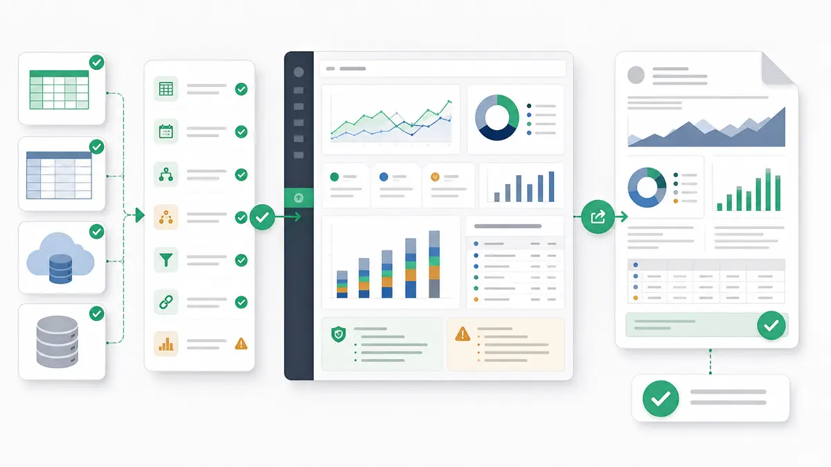
How Anomaly Helps Turn School Exports Into verifiable dashboards
Anomaly is an AI analyst workspace for school operations data, turning connected or uploaded data into verifiable dashboards and reports. For a school management dashboard, that means the workflow can start with the data schools already have: uploaded .xlsx, .xls, and .csv files up to 1GB, Google Sheets, or warehouse/database exports where those sources are available.
The useful pattern is simple:
- Upload or connect the relevant source files.
- Define the dashboard question, date window, join keys, and metric rules.
- Ask for dashboard sections such as attendance, assessment, cohort performance, intervention follow-up, missing data, and leadership summary.
- Review the generated logic, metric definitions, caveats, and source-backed calculations.
- Export the output as an interactive dashboard, Excel report/export, Excel-native dashboard export, PowerPoint slide, Word document, PDF report, or scheduled reporting workflow where appropriate.
That is the positioning: not magic, not automatic intervention, not a compliance shortcut. Anomaly helps teams turn messy data into traceable analysis and verifiable outputs, with source-backed calculations before the dashboard is shared.
For school operators, the value is the output layer. A data lead can inspect the calculation. A principal can review the dashboard. A district team can export a PDF or slide for the right meeting. A recurring workflow can carry the same metric definitions and business rules forward instead of rebuilding the dashboard from scratch every cycle.
There are boundaries. Anomaly does not claim a native SIS connector here. It does not turn periodic exports into real-time student monitoring. It does not guarantee root cause, predict student outcomes, assign interventions, or certify privacy compliance. It helps create a cleaner, more traceable analysis workflow from the files and data sources you are allowed to use.
If your school performance reporting is stuck in scattered exports, spreadsheets, and manual review notes, build a verifiable dashboard in Anomaly around the source files, definitions, caveats, and outputs your team can actually defend.
FAQ: School Management Dashboards and Student Performance
What should a student performance dashboard include?
A student performance dashboard should include attendance trends, assessment distribution, grade-band or cohort performance, intervention follow-up, missing or duplicate data checks, and a leadership summary. It should also show the date window, denominator, metric definitions, and caveats that affect interpretation.
How do you handle messy student IDs across files?
Use the most stable authorized student identifier available, then keep an exception log for unmatched records, duplicates, name-only matches, and source files with missing IDs. Do not silently merge uncertain matches. Put those exceptions into a data-quality section so reviewers know what needs source-system cleanup.
Can a dashboard predict which students need intervention?
No. A dashboard can highlight patterns that deserve professional review, such as attendance changes, assessment distribution, incomplete follow-up, or missing records. It should not claim guaranteed prediction, automated risk scoring, or causal proof unless those claims are separately validated and governed.
How should schools handle privacy in aggregate dashboards?
Schools should aggregate carefully, suppress or avoid small cells where needed, limit access by role, keep student-level details only for authorized users, and route sensitive outputs through the proper privacy or data-governance review. A dashboard tool does not replace FERPA review, written agreements, or local policy.
Can Anomaly replace a student information system?
No. Anomaly is not a SIS replacement and this article does not claim a native SIS connector. It is an AI data analyst for school reporting workflows that can help teams work with allowed exports, spreadsheets, Google Sheets, and supported data sources to create dashboards, reports, and stakeholder-ready outputs.