Quick answer — rail operations dashboard without enterprise BI
Build a rail operations or logistics dashboard without enterprise BI by collecting the exports you already trust, mapping stable route, terminal, asset, shipment, and date keys, defining service, delay, capacity, utilization, maintenance, and cost metrics, and publishing verifiable dashboard, Excel, PDF, slide, or scheduled reporting outputs. Treat it as management reporting for planning and post-shift review, not train control, safety dispatch, or real-time operations monitoring.
Start With the Rail Management Question
Many rail operations managers, logistics consultants, and finance leaders assume that building a useful rail operations dashboard requires a multi-year enterprise BI implementation. They assume they must first centralize every operational system, connect live telemetry, and hire a dedicated data engineering team before they can see basic performance trends.
That mindset creates project drag. While teams debate schemas, operational bottlenecks stay unresolved, terminal dwell questions keep returning, and customers still ask why a shipment was late.
The practical alternative is to start with a bounded management question. Instead of trying to build a do-everything system, focus on the decisions that drive daily and weekly performance:
- Route capacity: Which routes are consuming the most capacity, and where are the main bottlenecks appearing?
- Terminal dwell: Where is terminal dwell rising, and which yards need operational review?
- Service reliability: Which shipment groups or customer accounts missed service windows this week, and what were the recorded delay categories?
- Cost drivers: Which cost buckets, such as fuel, terminal charges, or labor, are driving movement cost on specific lanes?
- Post-shift review: Which operational exceptions from the last shift need investigation before the next planning meeting?
By framing the dashboard around these targeted questions, you narrow the data requirements. Instead of demanding live integration with every legacy rail system, you can answer a lot of management-reporting questions with the structured reports and exports your teams already generate and trust.
Inventory the Exports Before Joining Anything
Before joining datasets or building charts, inventory the data files already available inside the operation. Rail and logistics teams generate structured exports from terminal systems, transportation management systems, asset trackers, maintenance systems, finance systems, and manual exception logs.
Those files are often spreadsheets, CSVs, warehouse tables, or flat exports. To build a reliable dashboard, you need to understand each source's structure, cadence, and limitations. Common sources include:
- Schedules and service plans: Planned train runs, arrival and departure windows, route sequences, and service commitments.
- Movement and event logs: Actual train, shipment, car, or container movements with timestamps and location identifiers.
- Terminal and yard snapshots: Periodic exports showing cars, containers, or assets in specific yards, tracks, or terminals.
- Shipment, order, and waybill tables: Commercial records connecting shipments to customers, origins, destinations, commodities, and billing terms.
- Maintenance backlogs: Asset maintenance status, open work orders, and scheduled service intervals.
- Asset utilization files: Active, idle, stored, bad-order, or out-of-service status for fleet assets.
- Cost, fuel, and labor reports: Financial exports tied to movement cost, fuel consumption, crew hours, terminal charges, or exception costs.
- Data-quality exception files: Logs that flag missing IDs, duplicate rows, unmatched records, or stale timestamps.
Official rail reporting shows why definitions matter. The Surface Transportation Board's Reports & Data page says rail service data includes railroad performance on systems and by commodity, plus Chicago gateway information, with reports submitted weekly. The STB also exposes EP 724 Rail Service Data through its Open Data Portal.
The UP methodology for STB EP 724 is useful because it defines metrics such as train speed by train type, terminal dwell, cars on line, dwell time at origin, trains holding, cars not moved in 48+ hours, grain cars loaded and billed, outstanding car orders, plan versus performance, shuttle round trips, and cars originated or interchanged. The point is not to copy Union Pacific's exact reporting package. The point is that rail metrics need explicit formulas, exclusions, and timing rules.
For each internal export, document:
- Source owner: Who generates or approves the file?
- Update cadence: Is it daily, weekly, monthly, or shift-end?
- Date window: Does it cover the trailing shift, previous week, or a rolling period?
- Join keys: Which route, train, service, asset, shipment, terminal, customer, or date keys can link it to other tables?
- Exclusions: Are maintenance moves, stored assets, non-revenue runs, bad-order cars, or late cost records excluded?
- Data-quality flags: Which fields are known to be manually entered, missing, stale, or duplicated?
That inventory is not busywork. It is what keeps a polished dashboard from turning uncertain data into overconfident decisions.
Rail Operations Dashboard Planning Matrix
Use this planning matrix before building the dashboard. It maps each source to its join key, metric, section, caveat, owner, and output format so the dashboard is useful on its own and verifiable when challenged.
| Data source |
Join key |
Metric |
Dashboard section |
Caveat |
Review owner |
Output format |
| Service schedule / plan |
Route, train/service ID, date |
Planned vs actual arrival/departure, service-window adherence |
Service reliability |
Schedule changes and late plan updates can distort baseline comparisons |
Operations planner |
Dashboard / PDF |
| Movement/event log |
Asset/train/shipment ID, timestamp, location |
Delay bucket, dwell, not-moved flag |
Delay and exception review |
Event timestamps may reflect system-entry lag rather than physical arrival |
Operations analyst |
Dashboard / Excel |
| Terminal/yard snapshot |
Terminal ID, car ID, snapshot date |
Terminal dwell, cars on hand, cars held |
Terminal capacity |
Snapshot timing and excluded cars affect dwell calculations |
Terminal manager |
Dashboard |
| Shipment/order/waybill export |
Shipment/order/waybill ID, customer, lane, date |
Shipment status, fulfilled/unfulfilled, flow by lane |
Customer/stakeholder reporting |
Customer and commodity definitions can vary across commercial and operational systems |
Logistics owner |
PDF / Slides |
| Maintenance backlog |
Asset ID, work order, status date |
Open work orders, overdue maintenance, service-impact label |
Asset readiness |
Backlog status does not prove the cause of a service delay |
Maintenance lead |
Dashboard / Excel |
| Asset utilization file |
Locomotive/car/container/asset ID, date, route |
Utilization hours/days, idle time, turn time |
Asset utilization |
Use compatible definitions of active, idle, stored, and bad-order assets |
Fleet/asset manager |
Dashboard |
| Cost/fuel/labor report |
Movement ID, route, cost center, period |
Cost per movement, cost by lane, exception cost |
Cost visibility |
Accounting periods may not align with operational movement dates |
Finance/ops owner |
Excel / PPT |
| Data-quality exception file |
Source file, row ID, key field |
Missing IDs, duplicates, unmatched records, stale timestamps |
Review queue |
Exception count is a data-health metric, not an operational performance metric |
Data owner |
Excel / PDF |
Build Sections for Post-Shift and Leadership Review
A useful rail operations dashboard should match how leadership and operations teams actually review performance. Instead of one giant chart, organize the output into modules that answer specific review questions.
The FHWA's freight performance measurement guidance says freight-specific measures help identify needed transportation improvements, monitor effectiveness, and indicate economic health and congestion. The Freight Analysis Framework also shows the value of integrating multiple sources to understand freight movement by region, mode, commodity, tonnage, and value.
For a management dashboard, start with these sections:
Service Reliability
Compare planned service windows against recorded performance. Show schedule adherence, missed service windows, and repeated service exceptions by route, service group, customer group, or date window. Keep the planned window visible so readers do not confuse a revised plan with original performance.
Delay Buckets
When delays occur, leadership needs a clear review path. Group recorded delay categories such as congestion, crew availability, mechanical issues, terminal processing, loading delays, weather, or customer-side holds. Treat these as investigation buckets, not automatic root-cause proof.
Route Capacity and Congestion
Use movement logs, schedule files, and lane-level shipment records to show which routes or subdivisions appear constrained. This section supports capacity planning, route review, and customer communication. It should not present itself as live dispatch intelligence.
Terminal and Yard Dwell
Track terminal dwell, cars on hand, held cars, and not-moved records by terminal, yard, date window, car type, or service group where the source supports it. This helps terminal managers spot review areas before a leadership meeting.
Asset Utilization
Show active time, idle time, turn time, and utilization by asset group. Fleet managers can use this view to inspect underused or constrained assets, but the dashboard should label the definitions of active, idle, stored, bad order, and maintenance status.
Maintenance Backlog
Show open work orders, overdue maintenance, bad-order status, and service-impact labels where available. This supports asset-readiness review. It does not prove that maintenance caused a specific delay unless the source data explicitly supports that linkage.
Shipment Status
Show shipment status, lane flow, fulfilled versus unfulfilled orders, and exceptions by customer group, commodity, or route. This is the stakeholder reporting view: what moved, what did not, what needs explanation, and what caveat should accompany the update.
Cost per Movement
Join finance exports to route, movement, shipment, or cost-center fields where the keys are stable. This section can show cost per movement, cost by lane, and exception cost. Label accounting-period caveats clearly because finance data often lags operations data.
Data-Quality Exceptions
Keep this section visible. Missing IDs, duplicate movement rows, stale timestamps, unmatched shipment keys, and conflicting status fields should not disappear silently. They are part of the review workflow.
The Caveats Matter More Than the Chart
The hard part is not drawing a line chart. The hard part is making sure the line chart does not overstate what the exports prove.
Common rail and logistics caveats include:
- Join-key mismatches: A waybill export may use one customer or shipment ID format while the operations export uses another.
- Timestamp lag: Yard, movement, and exception records may be entered after the physical event.
- Plan changes: A train, route, or service plan may change during the period, which can make plan-vs-actual comparisons look worse or better than they are.
- Manual status updates: Delay codes and hold reasons may be entered inconsistently across teams.
- Lagging cost data: Fuel, labor, trackage, or terminal costs may post after the operational movement date.
- Duplicate movement rows: Repeated system events or multiple reads can inflate movement counts.
- Changing business rules: The definition of active, idle, held, stored, or delayed may change across systems or teams.
Use stakeholder-safe wording directly in the output:
- Instead of "total delay hours," say "recorded delay hours based on exported event logs, subject to manual entry lag."
- Instead of "unprofitable lanes," say "lanes requiring cost review; accounting periods may not fully align with movement dates."
- Instead of "failed deliveries," say "shipments requiring status review due to unmatched route or shipment keys."
That language is not weaker. It is more defensible.
What This Workflow Must Not Pretend To Be
This workflow is for management reporting, planning, retrospective review, and stakeholder communication. It is not an operational control layer.
Do not let a lightweight rail dashboard pretend to be:
- Train control or dispatch: It must not direct train movements, authorize track occupancy, control signals, or manage active dispatch.
- A safety-critical monitor: It does not provide live safety alerts or physical equipment monitoring.
- An FRA reporting or compliance system: Official safety, accident, incident, inventory, crossing, casualty, and operational reporting belongs in dedicated official workflows. The FRA Safety Data landing page exists for a separate safety-data domain; a management dashboard does not replace that.
- A real-time operations system: Periodic exports are not live telemetry.
- An automatic anomaly detector: A dashboard can surface exceptions for review, but it should not claim automatic anomaly detection.
- A guaranteed root-cause engine: The view can show where to investigate. It cannot automatically prove why a delay occurred.
- A forecasting or machine-learning system: This article is about descriptive reporting, not predictive modeling.
- A universal enterprise BI replacement: Larger organizations may still need governed semantic layers, complex access controls, and dedicated BI or rail operations platforms.
The boundary is simple: if the workflow affects active movement, safety-critical decisions, regulatory submission, or system-of-record transactions, it belongs in a dedicated operational or compliance system.
When Lightweight Dashboarding Is Enough
Lightweight dashboarding is enough when the job is verifiable management reporting from known exports.
It works well when:
- Source data arrives as periodic exports or warehouse tables.
- Stakeholders need weekly, monthly, or post-shift review rather than live monitoring.
- The team can define route, terminal, asset, shipment, customer, and cost metrics clearly.
- Caveats and data-quality issues can travel with the output.
- The deliverable is an interactive dashboard, Excel report/export, PDF, slide, Word doc, or scheduled email report.
Good-fit workflows include:
- Post-shift reviews: Inspect the last shift's movement logs, exception categories, and not-moved records before the next planning meeting.
- Route-capacity discussions: Review route congestion, service-window misses, and lane flow for recurring planning.
- Terminal dwell audits: Inspect yard snapshots and dwell definitions by terminal or car group.
- Customer shipment status packets: Package weekly performance notes for key customers or internal stakeholders.
- Finance cost reviews: Align operations and finance around cost per movement, lane cost, and margin-pressure questions.
In these scenarios, the value is not replacing enterprise BI. The value is getting a traceable, source-backed reporting workflow in place before the organization commits to heavier infrastructure.
When Enterprise BI or Rail Systems Are Still Necessary
Enterprise BI and dedicated rail systems are still necessary when the operating requirement is bigger than management reporting.
Use enterprise BI or a dedicated rail operations system when you need:
- Governed semantic layers: Many teams must calculate dwell, revenue, utilization, service reliability, or customer status the same way across many reports.
- Strict row-level access controls: Users need precise permissions by region, account, route, department, or role.
- Real-time operations and dispatch: Active train control, dispatch, telemetry, or equipment monitoring cannot be handled by a periodic export dashboard.
- Regulatory workflows and audit trails: Safety and compliance reporting require official, controlled systems and processes.
- System-of-record architecture: Billing, contracts, dispatch, safety events, and legal reporting need transactional source systems.
- Large organizational rollout: Thousands of users, many departments, and governed enterprise definitions may require a full BI program.
The choice is not "dashboard or enterprise BI forever." The better question is: what job needs to be done right now? If the job is a leadership review, route-capacity packet, cost review, or stakeholder update, a lightweight verifiable workflow may be enough. If the job is control, compliance, or enterprise-wide governance, use the right operational system.
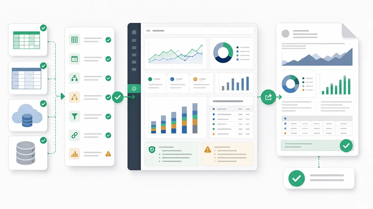
How Anomaly Helps Create Verifiable Rail Operations Outputs
Anomaly is an AI analyst workspace for operations data, turning connected or uploaded business data into verifiable dashboards and reports. For rail operations and logistics teams, that means the workflow can start with the files and tables already available: Excel and CSV operations exports, Google Sheets, warehouse tables, databases, or BigQuery rail or logistics data where those sources are available.
The workflow is practical:
- Upload or connect the relevant exports and tables.
- Define the route, service, terminal, asset, shipment, customer, and cost rules.
- Ask for dashboard sections such as service reliability, terminal dwell, delay buckets, shipment status, maintenance backlog, utilization, cost visibility, and data-quality exceptions.
- Review the generated logic, assumptions, calculations, joins, metric definitions, and caveats.
- Export the result as an interactive dashboard, Excel report/export, Excel-native dashboard export, PowerPoint slide deck, Word doc, PDF report, or scheduled reporting workflow.
For teams that receive messy files from clients or operating units, the same discipline applies as a repeatable dashboard workflow from messy CSVs: intake, field mapping, metric definitions, review notes, and output packaging come before the final chart. If the dashboard needs to become a leadership deck, pair it with a stakeholder-ready PowerPoint reporting workflow. If cost and margin review are part of the rail/logistics conversation, borrow the structure from an operational margin and cost review workflow.
The boundaries matter. Anomaly does not claim a native rail-system connector here. It is not a train-control system, dispatch system, safety system, real-time rail monitor, automatic anomaly detector, forecasting tool, compliance platform, or universal enterprise BI replacement. It helps teams turn the data they are allowed to use into traceable analysis and verifiable outputs before a review meeting.
If your rail and logistics exports, spreadsheets, and database tables are already available, build a verifiable operations dashboard in Anomaly and start turning those files into stakeholder-ready reporting.
FAQ: Rail Operations Dashboarding
What should a rail operations dashboard include?
A rail operations dashboard should include service reliability, delay buckets, route capacity, terminal or yard dwell, asset utilization, maintenance backlog, shipment status, cost per movement, and data-quality exceptions. It should also show source definitions, date windows, caveats, and review owners.
Can you build a rail dashboard without enterprise BI?
Yes, if the goal is management reporting from existing exports, spreadsheets, and warehouse tables. You can build a useful dashboard from periodic files when the join keys, metric definitions, caveats, and review owners are documented. That is different from replacing enterprise BI or operational rail systems.
What data sources do you need for a rail or logistics dashboard?
Common sources include service plans, movement logs, terminal snapshots, shipment or waybill exports, maintenance backlog files, asset utilization reports, cost and labor exports, and data-quality exception logs. The specific source list depends on the management question.
Is this a real-time rail control dashboard?
No. A dashboard built from exports is for retrospective review, post-shift analysis, planning, and stakeholder reporting. It must not be used for safety-critical operations, train control, active dispatching, or real-time telemetry monitoring.
When should a rail operator move to enterprise BI or a dedicated rail system?
Move to enterprise BI or a dedicated rail system when you need governed semantic layers, strict row-level permissions, active operations control, dispatch workflows, official regulatory reporting, system-of-record transactions, or broad enterprise rollout across many departments.