Customer Churn Analysis With AI: How to Get Numbers You Can Check
How to do customer churn analysis with AI while staying in charge: set the churn rule, see the working behind each number, check the trend is real, find early warning signs, and get a list of who to contact — on a downloadable sample.
AnubhavProduct Growth and UX at Anomaly AI
19 min read
Quick answer — customer churn analysis with AI
Customer churn analysis measures how many customers — or how much recurring revenue — you lose over a period, and where the loss concentrates. AI makes the twenty follow-up questions cheap, so the work becomes a short sequence of decisions you make and check: define what churn means, see the working behind each number, test whether a trend is real, find warning signs you can measure on current customers, and produce a list of who to contact. The risk AI adds is a confident wrong number, so you set the rule and check the working rather than trusting a black box.
If you have an export of customers — and maybe usage and account notes — you can use AI to find how many customers you lose, when, who, and what came before it, without trusting a number you can't check. This guide walks through churn analysis with AI as a set of steps where a person stays in charge: you write the churn rule, the AI shows its working, you correct it in plain English, and you verify before anything goes to leadership. Every number below is reproduced from a downloadable three-file sample, and the screenshots are genuine product runs on that sample in an AI data-analysis workspace.
For customer-success leads, founders, and operations or finance analysts · Excel, a database, a warehouse, or file upload
01What churn analysis answers, and what AI changes
Churn analysis answers four questions: how many customers you lose, when they leave, which groups leave most, and what happened before they left. Most teams stop after three queries — a churn rate, a chart, maybe a segment cut — because each new question is manual work. What AI changes is the cost of the follow-up: you can ask "how did you count that?", "adjust this for how long customers have been with us", or "who renews in the next 90 days" and get an answer in seconds.
The new risk AI adds is that a fluent wrong answer looks exactly like a right one. Practitioner evidence is blunt about this. The same month's churn can come out anywhere from 3.64% to 6.00% depending on which denominator convention you use (Flowsery), and mid-period joiners distort the rate if you are not careful (Shopify Engineering). One reproducibility study ran the same data-analysis task 480 times and found "considerable variation in the analytical results even for consistent configurations," recommending you run it more than once and look at the distribution (Cui & Alexander, 2026). OpenAI's own guidance is to "review the generated code, outputs, and assumptions before relying on the result" (OpenAI Help). So the value is not the AI's confidence; it is that you can make it show its working and check it.
02How teams actually use AI for churn analysis
Across real churn projects, "churn analysis" turns out to be several different jobs. A customer-success lead triages renewal risk — which contracts won't renew in the next 30, 60, or 90 days, and how much revenue is exposed. An insurance operator and a tutoring business argue about measuring the metric correctly: gross versus net, a reinstated policy that isn't new business, a thirty-day inactivity rule. A restaurant group and a beauty retailer have no cancellation date at all and infer churn from how recently and often people buy. Analysts and students look for drivers and at-risk groups. A collections team traces an unexplained revenue drop back to accounts. An industrial distributor researches lost customers with surveys and reviews.
Where AI earns its keep in those projects is consistent: agreeing the definition in plain English, reading inputs a BI tool can't (free-text notes, a satisfaction survey joined to customers), doing the whole pipeline in one place, and producing the deliverable — a board summary, a slide deck, a report. And where it stops is just as consistent: it explains, it doesn't predict; nobody pushes the at-risk list into a CRM automatically; the data is almost always periodic file uploads rather than a live feed. Elsewhere, people run a clean CSV with a ready-made churn flag through a chat tool and ask for a model — but the recurring complaint is validation: "how can we check the result without doing the whole work manually?" That is the gap this guide fills.
03Step 1: Tell the AI what churn means before it counts anything
Start from a raw export where churn has to be worked out from dates, not a file with a ready-made churn column. The example here is a scheduling app for dental clinics (a generic, labelled sample): 1,500 clinics on monthly or annual plans, January 2024 to December 2025, across three files — clinics.csv (plan, price, channel, region, renewal and cancel dates, cancel reason, reinstatements), monthly_usage.csv (appointments booked, active staff seats), and account_notes.csv (dated support tickets and success-team notes). Download all three and follow along:
Download the three-file sample
clinics.csv, monthly_usage.csv, and account_notes.csv — a generic dental-clinic scheduling app, 1,500 clinics over two years. They reproduce every number below. Synthetic sample data, no real customers.
The definition is where the number is made, so decide it before counting. A few choices carry most of the weight:
Contract or no contract. With cancellation dates you age churn straight from the dates. Without them — a restaurant, a retailer — "no order in 60 days" is a rule you pick, and 30 or 90 gives a different number. On this sample's usage panel, treating "no bookings for N months" as churned gives 18.9% at 30 days, 17.5% at 60, and 16.1% at 90 — the same customers, three answers. The established treatment for genuinely contract-free settings is a latent-attrition model (the Pareto/NBD and BG/NBD family associated with Fader and Hardie), which estimates the probability a customer is still active rather than imposing a cutoff; you don't have to implement one, but the threshold is an approximation of something with a proper treatment.
Customers or revenue. Logo churn counts customers; revenue churn weights the loss by what it was worth. On this sample the two track closely — the top 10% of clinics hold about 37% of monthly revenue, but the leavers are close to average size, so logo and revenue churn stay within about a point of each other. Whether they diverge is a property of your revenue concentration, not a given, so compute both.
Voluntary or failed payment. A cancelled card is not the same event as a customer choosing to leave, so keep them apart. In this sample, 43 of 318 cancellation events (13.5%) are failed payments. State that denominator every time — it is 13.5% of all cancellation events, not "13.5% of churn."
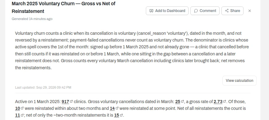
Reinstated or new. A clinic that cancels and comes back is the same customer, not a new one. This is where "gross versus net" bites: counting every voluntary cancellation in March gives a gross rate of 25 of 917 clinics active on the 1st = 2.73%; but 14 of those clinics were later reinstated, so net of those round-trips it is 11 of 917 = 1.20%. Gross leads, because at month-end you cannot yet know who will reinstate — the net figure uses later information and can only be finalised once the reinstatement window closes. So it is a restatement, not a contemporaneous warning sign.
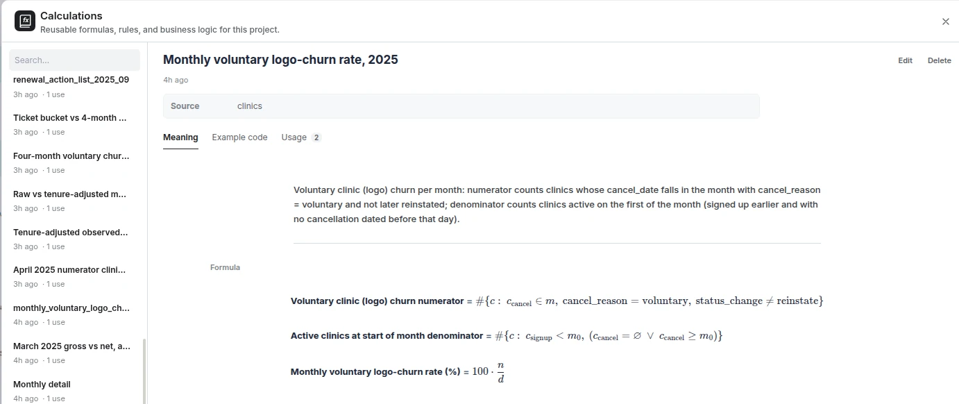
The formula, once the rule is set, is simple: monthly churn = clinics that cancelled in the month ÷ clinics active on the first day of the month. New sign-ups that month are not in the denominator — they were not at risk when the month began. Write the rule down once, save it as a reusable calculation so every later chart and every monthly report uses the same one, and the number can't drift between reports.
The rule stated back with its assumptions, then applied to March: 25 voluntary cancellations over 917 clinics active on the 1st (2.73% gross), and 11 of 917 (1.20%) once the 14 later reinstatements are netted out. First-party product screenshot; illustrative sample data.Saving the rule as a reusable calculation: the formula, its source table, and a "used in" count, so every later chart and monthly report draws on the same definition instead of a fresh guess. First-party product screenshot; illustrative sample data.
04Step 2: Make it show its working
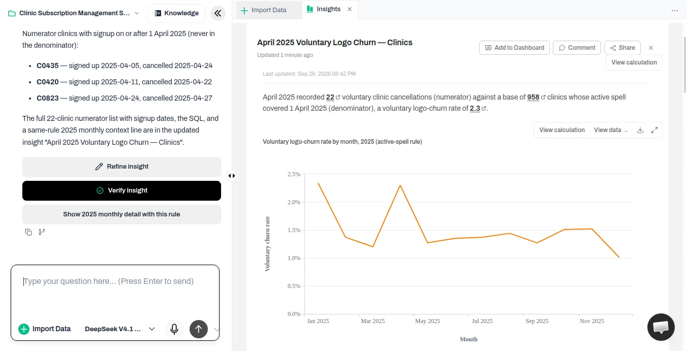
Once the AI has a rule, make it prove the count before you trust it. Open the calculation behind any number, click a figure to see its rows, and ask a plain-English question when something looks off. A worked example: ask for April's voluntary churn and the first pass returns 22 cancellations against 958 clinics active on the 1st — a rate of 2.30%.
First pass: April voluntary churn = 22 / 958 = 2.30%. The tool lists three of those 22 clinics — C0420, C0435, C0823 — that signed up during April, so they were never in the starting population. First-party product screenshot; illustrative sample data.
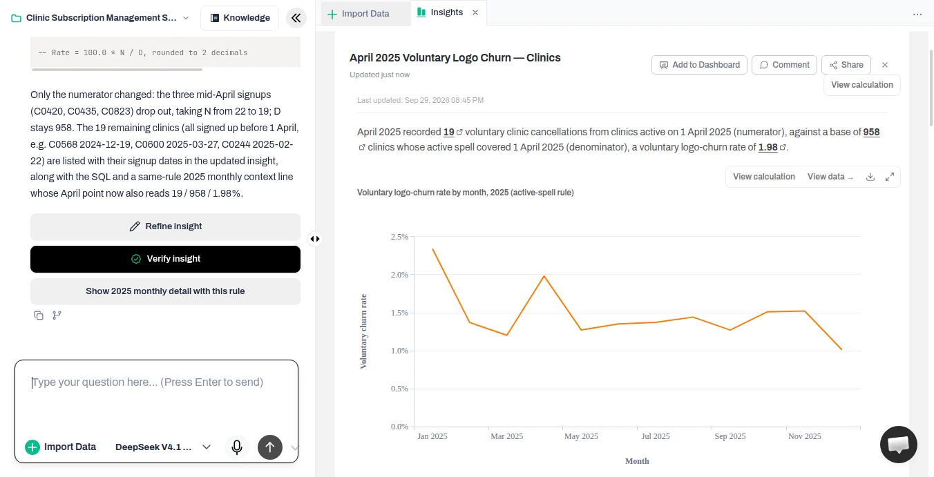
Reading the working shows the flaw: three of those 22 cancellations came from clinics that signed up in April, so they were never in the "active on the 1st" denominator. The fix is one sentence — "only count cancellations from clinics that were active on the 1st" — and the number moves to 19 of 958 = 1.98%.
After the plain-English correction: only clinics active on the 1st are counted, giving 19 / 958 = 1.98%. First-party product screenshot; illustrative sample data.
This is the boundary rule worth stating in one line: a clinic that signed up on the 1st was not yet a customer when the month began, so it is excluded; a clinic that cancelled on the 1st was still active at that instant, so it is counted. Only cancellations from clinics active on the first belong in the numerator. That single rule keeps the numerator inside the denominator, which is exactly the check a person can make and a black-box answer can hide.
05Step 3: Check the trend is real, not a change in who your customers are
Newer customers leave more often. If sign-ups slow, the base ages and a monthly churn rate can drift down on its own, with no change in how well you retain customers. So when a rate falls across the year, ask the AI to adjust for how long customers have been with you before you read anything into it. On this sample the raw monthly voluntary rate slides from about 2.3% in January to 1.0% in December — a slide worth testing before you trust it.
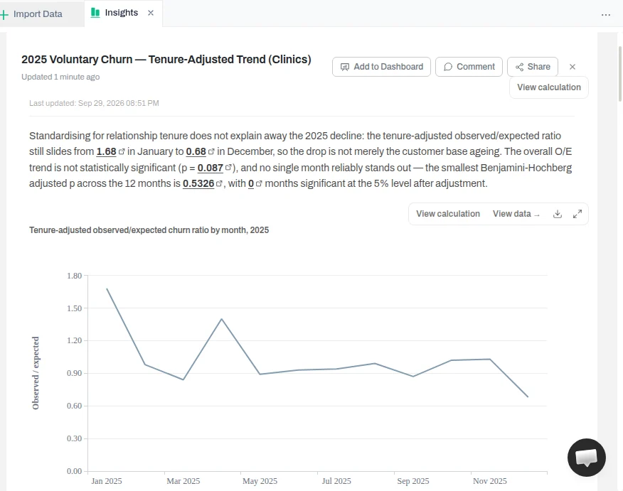
Raw versus tenure-adjusted monthly voluntary churn, 2025. After standardising for relationship tenure (voluntary exit as the event, failed payment censored), no month's Benjamini-Hochberg adjusted p falls below 0.05 across the twelve tests. First-party product screenshot; illustrative sample data. The product standardises with five tenure bands; an independent reproducer using per-tenure-month hazards gives the same raw counts and the same "no month stands out" verdict.
Standardising the rate for the tenure mix — treating a voluntary cancellation as the event and a failed payment as censoring, with tenure measured from each clinic's first sign-up — gives a deliberately modest result. Adjustment does not explain the raw decline away, but it does not confirm a real improvement either: after adjusting for customer age, the overall downward trend is not statistically reliable — the product reports p = 0.087 for it — and no single month reliably stands out. The smallest Benjamini-Hochberg adjusted p across the twelve months is 0.53, and zero months are significant at the 5% level after correcting for having tested twelve of them. The honest read is that the data does not support a confident claim that churn genuinely improved, and that scanning twelve months for the "worst" one manufactures a finding unless you correct for the search.
06Step 4: Find where churn concentrates without inventing differences
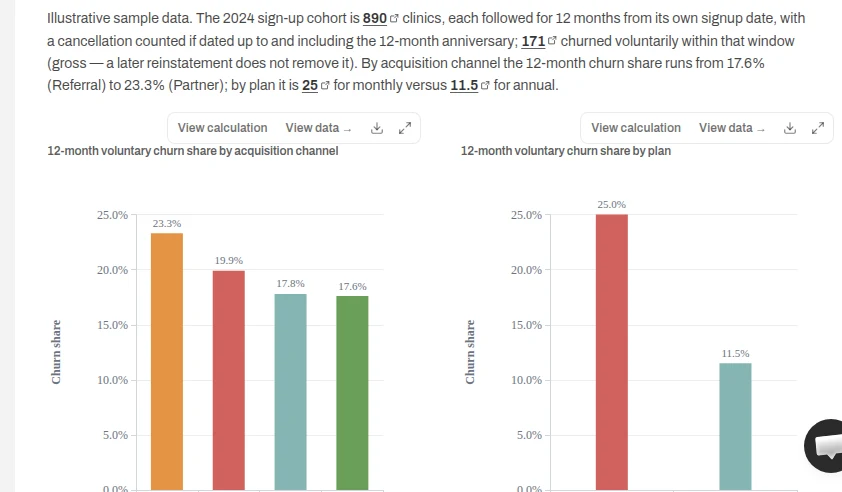
The next question is where churn lands, and the order of operations matters: read the error ranges first, then test one plausible hidden factor. To keep the comparison fair, this step follows the 2024 sign-up cohort — 890 clinics — for a fixed 12 months each, so older and newer sign-ups get equal time to leave.
By channel, the raw table reads like a story: Paid clinics churn at 19.9% against Referral's 17.6%. But that gap is only about two percentage points and sits well inside the Wilson 95% ranges, so ranking channels off the raw numbers would be reading noise.
Acquisition channel
12-month voluntary churn (Wilson 95% CI)
Partner
23.3% [16.5, 31.7]
Paid
19.9% [15.9, 24.7]
Organic
17.8% [13.7, 22.9]
Referral
17.6% [12.9, 23.5]
12-month voluntary churn for the 2024 sign-up cohort (890 clinics). The channel bars overlap within their error ranges; monthly plans (25.0%) churn well above annual (11.5%). First-party product screenshot; illustrative sample data.
Then hold the plan constant. Monthly plans are associated with the difference — a monthly clinic's odds of churning are about 2.95 times an annual clinic's (95% CI 1.97 to 4.40) — while no channel differs reliably from Referral once plan is in the model (Paid's adjusted odds ratio is 0.73, 95% CI 0.45 to 1.19, not significant). Report a result like this as "associated with, holding plan constant," never "drives." The honest read is that the spread across channels is not a reliable ranking, while plan type is a real, separable difference — and the discipline that got you there was checking the error ranges before believing any gap.
07Step 5: Churn indicators you can use on today's customers
An indicator is only useful if you can measure it for a customer who hasn't left yet. That rules out anything measured relative to the cancellation date, and it rules out account notes as a predictor. A note reading "asked about cancelling" is not a warning sign — it is churn already under way, recorded by a human who could see it coming, and it cannot be computed for a clinic whose success manager hasn't noticed anything. So notes are context for a person, never evidence that an indicator works.
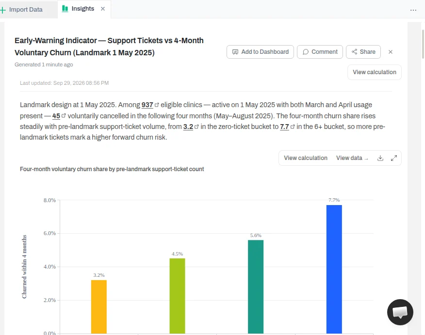
What does work is a landmark design: fix a date, measure the signal strictly before it, and measure the outcome strictly after. Counting support tickets in the two months before a landmark, then looking at voluntary churn in the four months after, the signal rises with ticket volume and is measurable on a live customer today.
Four-month voluntary churn by pre-landmark support-ticket count: 3.2% at zero tickets, 4.5% at 1–2, 5.6% at 3–5, 7.7% at 6+ (Wilson 95% intervals; 937 eligible clinics). The signal is measured before the landmark and the outcome after it, so it is usable on a current customer. First-party product screenshot; illustrative sample data.
Two honesty notes belong on this chart. First, the buckets rise monotonically but their confidence intervals overlap at this sample size, so the right reading is "directionally consistent," not a precise ranking. Second, prefer a change signal over a level: bookings falling against a clinic's own recent normal identifies risk, while a raw booking level mostly identifies small clinics. In this sample, bookings tend to drop about six weeks before a voluntary cancellation — a signal you can watch, not a coincidence you notice afterwards.
08Step 6: Turn it into a list someone can act on
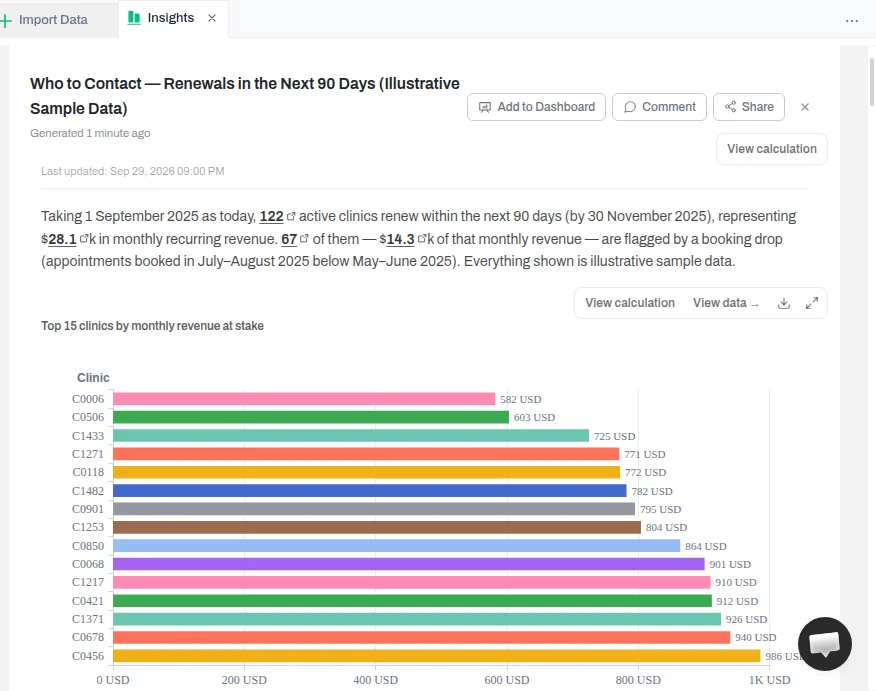
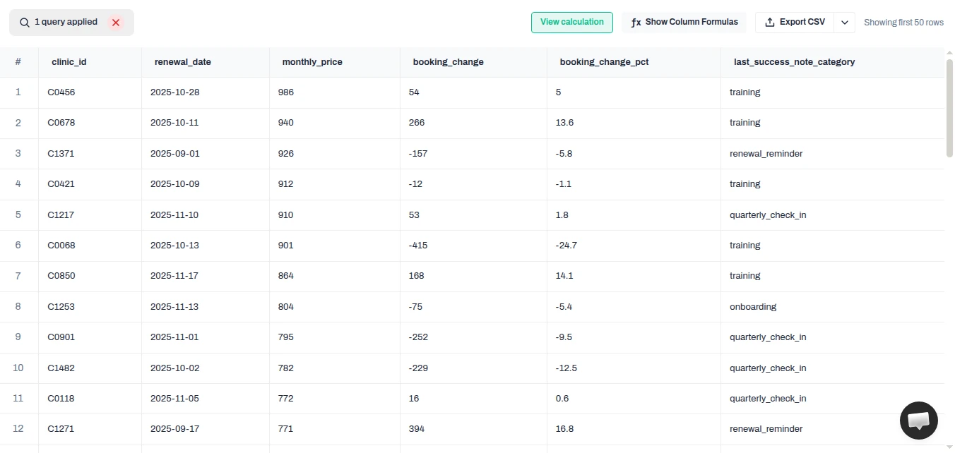
The analysis should end in names, dates, and money, not another chart. Ask for the clinics renewing in the next 90 days, with the monthly revenue at stake and the reason each is flagged, sorted by revenue rather than by risk alone — so the person deciding who to call on Monday sees where the money is.
The headline of the list: 122 clinics renew in the next 90 days ($28,063/month), of which 67 are flagged by a booking drop (July–August bookings below May–June), with a bar chart of the top 15 by monthly revenue at stake. First-party product screenshot; illustrative sample data.
What makes it actionable is the row underneath the headline: for each clinic, the reason it is on the list. The same list sorted by revenue shows every clinic's booking change against its own recent normal and the category of its most recent success note — dated context a person can read, never a free-text note dressed up as a prediction.
The same list at row level, sorted by monthly revenue at stake: each clinic's booking change against its own recent normal (July–August vs May–June) and the category of its most recent success note as dated context — a training session, a renewal reminder — never a free-text note that reads like a human predicting churn. First-party product screenshot; illustrative sample data.
The value-weighting matters: a 2% churn rate on your largest accounts costs more than a 6% rate on your smallest, so the list leads with revenue at stake, shows the change in bookings against each clinic's own recent normal, and carries only a dated, categorical context note (a training session, a renewal reminder) — never a free-text note that reads like a human predicting churn.
09Step 7: Verify, then put it on a schedule
Before anything goes to leadership, run an independent re-check. A verify step re-derives the numbers from the source rows separately from the first run, and a good tool never calls an unchecked result verified — it flags cautions, like a month whose base is too thin to read a small swing.
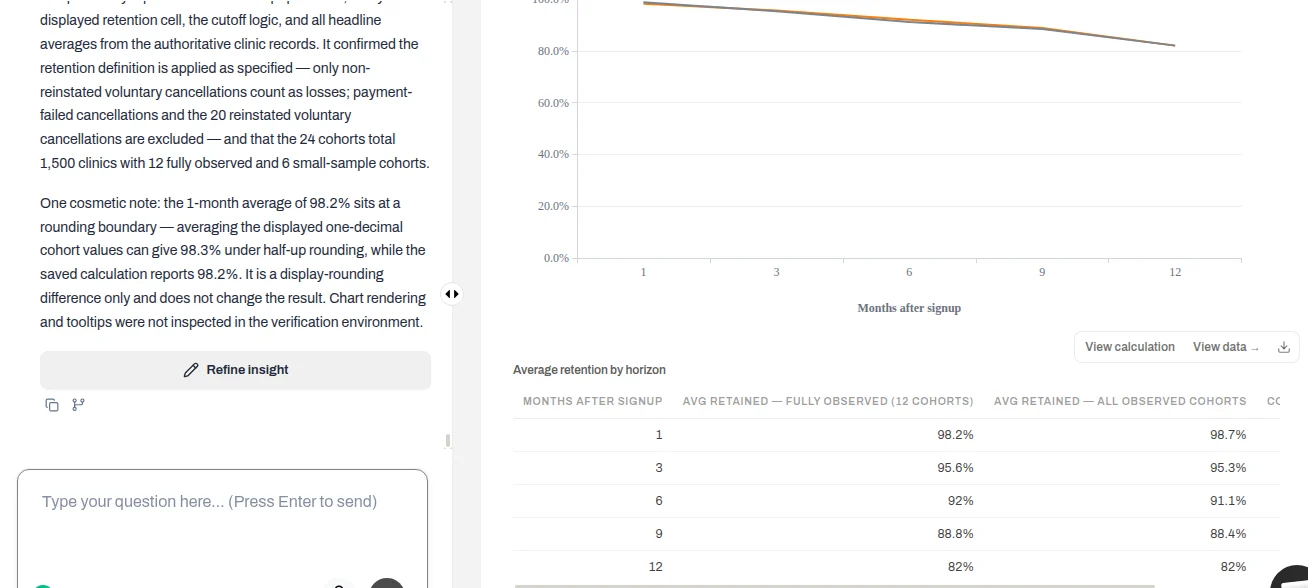
An independent verifier re-derives the numbers from the source rows and reports what it checked — here confirming the retention definition, the 24 signup cohorts of 1,500 clinics, and the 12 fully-observed versus 6 small-sample split, with only a display-rounding note. First-party product screenshot; illustrative sample data.
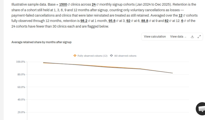
Cohort retention is the view most worth reading carefully. Group customers by signup month and track the share still active at 1, 3, 6, 9 and 12 months; on this sample, average retention runs from about 98% at one month to roughly 82% at twelve across the twelve fully-observed cohorts. Read it with the group sizes in view, though: six of the twenty-four cohorts have fewer than 30 customers and carry several points of noise, and the far-right column describes a different, smaller population than the left, so don't quote the two ends as comparable.
Average retained share by months after signup for the signup-month cohorts, counting voluntary cancellations as losses. Twelve cohorts are fully observed through 12 months; six small cohorts (under 30 customers) are flagged. First-party product screenshot; illustrative sample data.
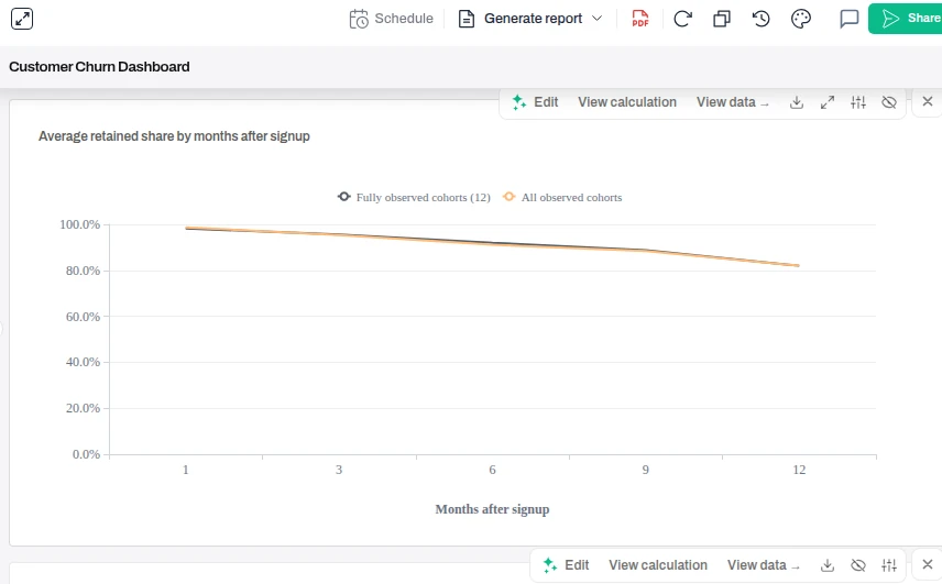
Once the result holds, assemble the churn rate, cohort retention, and segment cuts into a single dashboard, each tile built from the same saved rule so the numbers stay comparable between refreshes.
The saved churn dashboard collects the retention view on one surface, each tile built from the same saved rule so the numbers stay comparable between refreshes. First-party product screenshot; illustrative sample data.
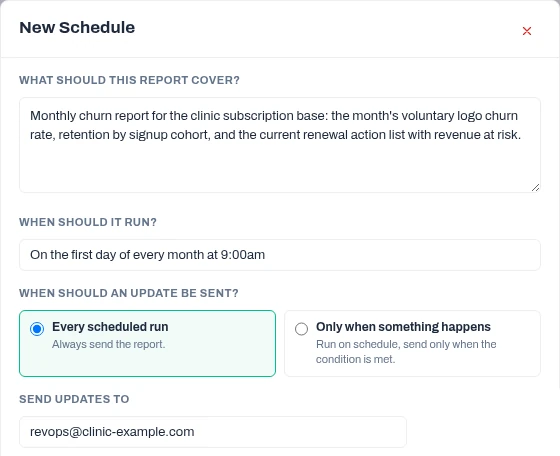
Then schedule it as a monthly emailed report on a paid plan: describe what the report should cover, set it to run on the first of each month, and send it by email to the people who act on it. Each run reuses the saved rule, so the numbers stay comparable month to month.
Scheduling the dashboard as a monthly emailed report: describe the contents, set a monthly run, and send it by email. First-party product screenshot; illustrative sample data.
Churn sits alongside the other SaaS metrics you can track with AI — activation, expansion, revenue retention — so one refresh can carry the whole set. For an uploaded-file source, re-upload the latest export before each run, or the report uses the file you last uploaded.
10Can AI predict churn?
Not from this kind of analysis, and it is worth being clear about the difference. Everything above is descriptive: it measures how much churn happened, when, and which groups it concentrated in, and it surfaces signals that were associated with churn in your data. Real prediction — a model that scores which individual customers will leave next — needs activity history, enough customers who actually churned to learn from, and a held-back test group to check the score against what really happened. It is a separate machine-learning task with its own methods and failure modes. Two traps make the descriptive work masquerade as prediction: reading "X goes with churn" as "X causes churn," and scanning many segments until one looks significant by chance. Fixing the time ordering (measuring a signal strictly before the outcome) removes one rival explanation and no more; it does not establish cause. An honest churn analysis stops at the checkable description of what the data shows — and says so.
11Eight checks before you trust an AI churn number
The churn rule is written down, and saved so every report uses the same one.
The denominator is customers active on the first of the period — sign-ups on the 1st excluded, cancellations on the 1st counted, and reinstated customers still in their cancel-to-return gap excluded.
Reinstatements are handled deliberately: gross counts every voluntary cancellation, net of round-trips is a later restatement.
Failed payments are separated from voluntary churn, and the failed-payment share states its denominator.
The trend is adjusted for how long customers have been with you before it is read as good or bad news.
Segment differences carry error ranges, and you don't rank groups the intervals can't separate.
At least one hidden factor is checked before a segment gap is believed.
Every indicator is measurable before the outcome, and an independent re-check has passed.
Do the analysis this way and you get a churn number you can defend, a trend you have tested, warning signs you can act on, and a list of who to contact — with the calculation visible so you can check it before you share it.
FAQFrequently asked questions
How do you calculate churn rate?
Churn rate for a period is the number of customers who cancelled during the period divided by the number of customers active at the start of it. Customers who signed up during the period are not in that denominator, because they were not yet at risk when the period began. The convention you choose for the denominator changes the number: the same month can come out anywhere from about 3.64% to 6.00% depending on whether you divide by the opening count, an average of opening and closing, or opening revenue, so publish the method next to the percentage.
Is 20% churn high?
There is no universal benchmark, and you should be wary of any figure quoted without context. Whether 20% is high depends on your business model, whether you bill monthly or annually, the size of your customers, and how you defined churn in the first place. It is far more useful to compare your churn to your own history and across your own segments — whether it is trending down once you adjust for customer tenure, and which plans, channels, or cohorts sit above your average — than to compare it to a number copied from elsewhere.
What does 'AI churn' mean?
'AI churn' is shorthand for using AI to analyse or predict customer churn; it is not a product category or a special kind of churn. In practice it splits into two very different tasks: using an AI tool to measure and explain churn from your data — calculating the rate, checking the trend, finding segments and signals — and building a model that predicts which individual customers will leave. This guide is about the first, which is descriptive and checkable; the second is a separate machine-learning problem.
Can AI predict churn?
Descriptive churn analysis, of the kind shown here, does not predict individual churn — it measures how much churn happened and surfaces signals associated with it. Real prediction needs activity history, enough customers who actually churned to learn from, and a held-back test group to check the score against what really happened. Even then, an association in past data is not a cause, and scanning many segments finds false patterns unless you correct for the search. Treat any tool that outputs a per-customer churn score with the same scepticism you would apply to any prediction: ask how it was validated.
Can ChatGPT do churn analysis?
It can help explore a clean file that already has a churn flag, but there are real limits to check. Files can upload without being fully analysed, and the accuracy of statistical work depends heavily on how specifically you prompt. Studies have found the same analysis task gives noticeably different answers across repeated runs, so a single answer is a snapshot, not a settled result. The practical fixes are the same ones in this guide: make it show its code and assumptions, agree the churn definition explicitly, and re-check the numbers rather than trusting the first fluent answer.
How accurate is AI churn analysis?
It is as accurate as the rule you set and the checking you do, not a fixed property of the tool. The main sources of error are a wrong denominator, an undefined churn rule, reading a raw trend that is really the customer base ageing, and ranking segments the data can't separate. Accuracy also depends on prompt detail and can vary between runs, so the reliable approach is to define the rule, view the working behind each number, adjust for customer tenure, put error ranges on segments, and run an independent re-check before sharing.
What should I remove from a customer file before uploading it?
Remove personal data you do not need for the analysis — names, emails, phone numbers, and any free-text that identifies individuals — and keep a stable customer ID so you can still count and join. Churn analysis needs dates, plan, price, channel, and activity, not identities. If the file contains client or customer data you do not own, get permission before putting it into any AI tool, and prefer a workspace where you can see and control where the data goes.
What is the difference between churn and attrition?
In customer analytics the two words are used interchangeably: customer attrition analysis and customer churn analysis both mean measuring the customers you lose over time and where the loss concentrates. The one place to watch is context — 'attrition' is also the standard word for employees leaving (HR or employee attrition), which is a different dataset and a different set of questions. This guide is about customer churn; employee attrition uses similar techniques on a different population.