Best Automated Reporting Tools for Small Teams in 2026
Automated reporting tools don't all automate the same thing. Here's how a small team picks between a refresh tool, a BI dashboard, and an AI analyst in 2026.
Abhinav PandeyFounder, Anomaly AI (ex-CTO & Head of Engineering)
12 min read
Spreadsheets
Coefficient
Zapier
Data Studio
Power BI
Anomaly AI
Quick answer — best automated reporting tools for small teams in 2026
There's no single best automated reporting tool for a small team, because these tools don't automate the same thing. Pick by the stage of your reporting that actually eats the time. To pull fresh data into a spreadsheet automatically, use a refresh tool like Coefficient. To stitch steps and delivery between the apps you already use, reach for Zapier. For a dashboard that emails itself on a schedule, choose free Data Studio (formerly Looker Studio), or Power BI if you're already in Microsoft. And when the hard part each cycle is making sense of messy data and defending the numbers, use an AI data analyst like Anomaly AI. Often, a scheduled spreadsheet you already own is enough.
Automated reporting tools promise to hand back the hours a recurring report quietly takes — the export, the clean-up, the same chart rebuilt, the email sent before someone notices it's late. For a small team with no dedicated data or BI person, that's worth a lot. But the tools making the promise aren't competing for the same job. One automates pulling fresh data in, another automates moving it between apps, another automates building and sending a dashboard, and another automates the analysis in the middle. Choosing well starts with naming which of those you actually need.
This guide compares six ways a small team can automate recurring reporting, judged on the work of doing it again next week rather than on feature counts. Pricing was checked against each vendor's live page in August 2026; where a vendor only quotes custom pricing, that's noted rather than guessed.
The recurring reporting cycle — four stages you can automate
The four stages. Fresh data comes in (refresh), someone works out what happened and checks it (analyze and verify), it becomes a dashboard or document (assemble), and it reaches stakeholders on time (deliver) — then the whole thing runs again next week.
Where tools differ. Most automate one or two stages well and leave the rest to you. A spreadsheet add-on automates the refresh; a BI tool automates assembly and delivery; an analyst tool automates the part in the middle — making sense of the data and keeping it checkable.
Name the stage that actually costs you time. That's the tool you're shopping for — not the one with the longest feature list.
01What actually decides the right automated reporting tool
Feature lists blur together. Five questions do more to separate the tools that will genuinely save a small team time from the ones that just move the work somewhere else:
1
Source intake and refresh
Which of your sources does it connect to, what still has to be exported and pasted by hand, and how does fresh data reach the report — automatically, on a schedule, or on a click?
2
Repeatability
Can you build the logic once and reuse it, so each cycle picks up where the last left off — or does every report start closer to scratch than you'd like?
3
Reviewability
Before a report goes out, can you see the definitions, filters, calculations, and source rows behind the numbers? Tools expose this very differently, and the difference is what costs you when a figure is challenged.
4
Output and delivery
What actually gets delivered — a dashboard, a PDF, a spreadsheet, an email — and can you schedule it to the right recipients without babysitting the send?
5
Small-team operating burden
Setup, maintenance, permissions, and the skills required — and, the part that quietly decides more than anyone admits, how the price scales as you add users, sources, or reports.
These aren't the same tool's strengths. A tool can be excellent at refresh and useless at review, or great at delivery and blind to whether the numbers are right. So before comparing anything, settle the one question the rest of this depends on: which stage of your reporting is the bottleneck?
Your bottleneck points to a tool
A small, stable report from one or two sources that mostly needs to go out on timeA scheduled spreadsheet
The same fresh data copied into a spreadsheet every cycleCoefficient
Data and report are fine; the friction is moving and sending things between appsZapier
A free dashboard that emails itself, in the Google stackData Studio
A governed BI home for recurring dashboards, already in MicrosoftPower BI
Messy recurring data where every number has to be understood and defendedAnomaly AI
02The six options at a glance
Here's the shortlist, and the single stage each one is built to automate. Treat the prices as entry points — read them next to the free tiers and billing basis noted in each row, and against your own volume.
Option
Automates
Entry price (2026)
Best-fit bottleneck
Spreadsheets
Assembly + light scheduling (you build it; Apps Script or Power Automate sends it)
Free with existing accounts; ~$7/user/mo on annual Workspace or Microsoft 365 plans
A simple, stable, single-source report you already maintain
Pro $14/user/mo (paid yearly); Premium Per User $24/user/mo (paid yearly)
A governed BI tool when you're already in Microsoft
Anomaly AI
Analysis and verification, then reviewable dashboards, reports, and documents
Free to try; Pro $25/mo; Team $45/seat/mo (2-seat min, $90/mo)
Recurring reports where the numbers must be reviewable
Pricing verified against each vendor's live page, August 2026. Order:·
03Start here: is a scheduled spreadsheet enough?
Before you buy anything, rule out the tool you already have. If your report draws from one or two stable sources, fits in a spreadsheet, and mostly needs to go out on time, the honest answer is often a spreadsheet plus a little automation — not a new subscription. Google Sheets can pull from other sheets and refresh on a schedule, Apps Script or a scheduling add-on can email a copy every Monday, and Excel with Power Automate does the equivalent. The business plans that include these run about $7 per user per month on an annual Google Workspace or Microsoft 365 plan, and you're very likely paying for one already.
A spreadsheet stops being enough at a predictable point: when the source data is too big or messy to keep opening, when the same clean-up has to be redone by hand every cycle, when several people need to touch the report without breaking it, or when a wrong formula could go out unnoticed. Those are the moments the tools below are for. And if your question is really how to build the workflow rather than which tool to buy, there are step-by-step guides to self-updating Google Sheets reports and to turning a sheet into a scheduled, reviewed PDF that will get you further than a new platform.
04Automate the data refresh: Coefficient
If the part that eats your week is getting fresh data into the report — exporting from one system, pasting it into a spreadsheet, redoing it next week — the fix is a refresh tool, not a reporting tool. Coefficient connects live data from business systems like Salesforce, HubSpot, and databases straight into Google Sheets and Excel, and can keep it current on a schedule so the numbers under your report update themselves. Its free tier is genuinely usable — three data sources, 5,000-row imports, and 50 manual refreshes a month — but scheduled automatic refresh starts on the paid Starter plan, $49 per month billed annually ($59 month-to-month) for daily refresh, with a Pro plan at $99 per user per month billed annually ($119 month-to-month) for hourly refresh, capped at five users. It can also snapshot data into a spreadsheet tab on a schedule and fire an email or Slack alert when a number crosses a threshold.
What Coefficient isn't built to do is analyze or verify the data for you. It moves and refreshes it; the report, the interpretation, and the checking stay yours. That's the right trade when your template is solid and the only pain is keeping it fed. If your sources are specifically marketing and ad platforms — Google Ads, Meta, GA4 — Supermetrics is the better-known option for the same refresh job, from $55 per month ($44 billed annually) with no free tier, though on its cheapest plan the scheduled refresh into Google Sheets runs only weekly. Agencies juggling many clients' accounts have a different shortlist entirely, which is covered in client reporting tools for marketing agencies.
05Automate the handoffs: Zapier
Sometimes the data is fine and the report is fine; the friction is everything in between — copying a figure from one app to another, kicking off the export, sending the finished file to the right place on the right day. That's automation glue, and Zapier is the default for it, connecting thousands of apps and running multi-step workflows on a trigger, including a built-in schedule. Its free plan covers 100 tasks a month across two-step workflows; the Professional plan starts at $19.99 per month billed annually ($29.99 month-to-month) and rises with the task volume you choose, and the Team plan starts at $69 per month billed annually with 25 users. (The old Starter plan has been retired, so ignore any price list that still shows it.)
The thing to understand before you lean on it is that Zapier is built to orchestrate other tools, not to analyze data or assemble a report — it now bundles Tables, Forms, and AI steps, but its job here is moving and triggering, not the analysis. Billing is task-based, and the accounting is easy to misread: a successful action step generally uses a task, while triggers, filters, paths, failed steps, and several built-in tools don't, so a busy multi-step workflow can still add up faster than the sticker price suggests. For a small team, Zapier earns its place as the connective tissue around your other tools, not as the reporting tool itself.
06Dashboards that email themselves: Data Studio and Power BI
If what you want is a dashboard that you build once and that then arrives in inboxes on a schedule, two established tools cover most small teams, split cleanly by which ecosystem you already live in.
Data Studio is free, connects natively to GA4, Google Ads, Search Console, Sheets, and BigQuery, and can email a report as a scheduled PDF — which, for a Google-centric team, is often the entire automated-reporting problem solved at no cost. The limits show up at the edges: the free tier allows only about one active delivery schedule per report, data freshness depends on how each connector caches, and in the free tier reports are owned by the individual who creates them rather than the organization. Data Studio Pro adds organization-owned content, team workspaces, IAM controls, higher delivery limits, and Gemini assistance at about $9 per user per project per month. If your interest is specifically free BI as a Power BI substitute, that's its own comparison — see free Power BI alternatives for small business.
Power BI is the heavier, more governed option, and the natural pick if your team already runs on Microsoft 365. It models data, refreshes datasets on a schedule, and sends report "subscriptions" as scheduled emails — but the scheduling and sharing sit behind a paid seat: Power BI Pro is $14 per user per month and Premium Per User is $24, both paid yearly, with scheduled refresh on Pro capped at eight times a day. In general the people who receive shared content also need a seat, though eligible Premium or Fabric capacity can let free users consume it. It's more tool than a two-person team usually needs, and it carries a real modeling learning curve, but for a small team inside Microsoft that wants one governed place for recurring dashboards, it's a reasonable home. Teams that already run a database and want free scheduled dashboard emails sometimes reach instead for Metabase, which is free if you self-host it — its managed cloud plans start at $100 per month — and sends dashboard subscriptions by email or Slack.
07When the hard part is trusting the numbers: Anomaly AI
The tools so far fall into two camps. Refresh and orchestration tools — a spreadsheet add-on, Zapier — move and deliver data but don't do the analysis. BI tools — Data Studio, Power BI, Metabase — can model and calculate, but they expect your team to define the metrics, build the report, and keep the logic current. In both cases, your team remains responsible for choosing and validating the metrics that belong in the report. Plenty of recurring reporting isn't like that. If each cycle someone has to open a messy export, work out what actually happened, and be ready to defend the figures when a stakeholder pushes back, then the stage you need to automate is the analysis itself, and that's a different kind of tool.
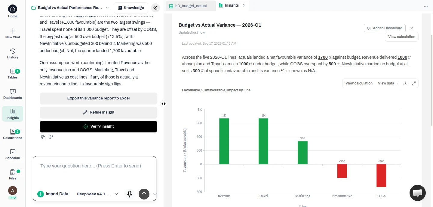
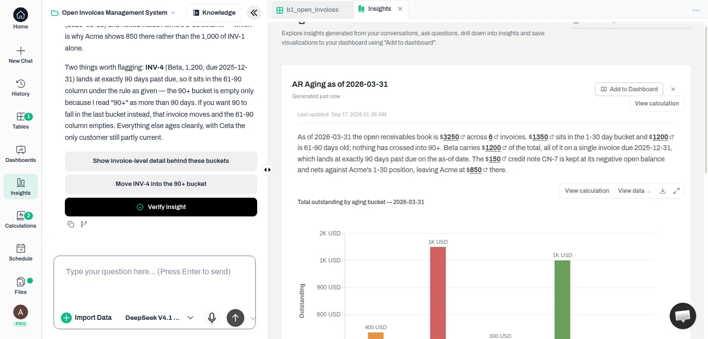
Anomaly AI is an AI data analyst built for that stage. You upload Excel or CSV files up to 1GB, or connect GA4, Google Sheets, BigQuery, MySQL, or Snowflake, ask in plain language for what you need, and it writes the query, answers with a chart or table, and turns the result into a dashboard, an Excel report, a slide deck, a Word document, or a PDF. The part that matters for recurring reporting is what sits underneath: you can inspect the source data, the queries, the filters, the assumptions, and the calculations behind any number before it goes out, and it holds onto your metric definitions and business rules so the report stays consistent from one cycle to the next. When a number moves, you have the working, not just the chart. An uploaded file is a snapshot — it stays as the data you uploaded until you upload a fresh copy — while a connected source like GA4 or a database can be re-queried. The free tier lets you try the analysis; Pro is $25 per month; and the Team plan is $45 per seat per month, with a two-seat minimum, so $90 per month, and credits pooled across the team.
A weekly report Anomaly built from a CSV
First-party Anomaly AI product screenshot; figures are illustrative sample data. From an uploaded weekly CSV, Anomaly built these revenue, orders, and refund-rate cards with a revenue-by-category bar chart and a weekly category breakdown. Each figure is traceable to the source data. Anomaly AI.
Anomaly can also schedule a report as a recurring email with a PDF attached on the Pro plan, but treat that as a convenience rather than the reason to choose it: scheduled delivery is still maturing — an uploaded-file dashboard won't refresh on its own, a failed source refresh can hold up a send, and schedules run on UTC — so the durable reason to reach for Anomaly is the analysis and the inspectable logic, not the scheduler.
What "check it before it goes out" looks like
Illustrative. The value isn't only the finished report — it's that each figure traces down to the query, filters, and source rows behind it, so a small team can check it before it goes out. An AI data analyst like Anomaly AI keeps that trail open.
Be clear about where Anomaly isn't the answer. It's not a real-time or streaming monitor, it doesn't deliver to Slack, it isn't a turnkey white-label client portal, and despite the name it doesn't do automatic anomaly detection or guaranteed root-cause analysis. If your reporting is standard, stable, and already trusted, a refresh tool or a BI dashboard will automate it more cheaply. Reach for an analyst tool when the recurring cost is making sense of the data and standing behind the result.
08Match the tool to your team
A small, stable report from one or two sources that mostly needs to go out on time
a scheduled spreadsheet you already own.
The same fresh data copied into a spreadsheet every cycle
a refresh tool like Coefficient — or Supermetrics for ad data.
Data and report are fine; the friction is moving and sending things between apps
Zapier as the glue.
A free dashboard that emails itself, living in the Google stack
Data Studio.
A governed BI home for recurring dashboards, already inside Microsoft
Power BI.
Messy recurring data where the numbers must be understood and defended
Anomaly AI.
Whatever you shortlist, price it against your own volume before committing. The free tool that needs an hour of upkeep every week isn't free, and the per-user plan is cheap until the team grows. Automating a report you'll send once is rarely worth the setup; automating the one you'll send fifty more times almost always is.
FAQFrequently asked questions
What is the best automated reporting tool for a small team?
There isn't a single best; it depends on which stage of reporting you need to automate. To pull fresh data into a spreadsheet, a refresh tool like Coefficient. To move and send things between apps, Zapier. For a dashboard that emails itself, free Data Studio, or Power BI if you're already in Microsoft. When the hard part is making sense of messy data and defending the numbers, an AI data analyst like Anomaly AI. And when the report is simple and stable, a scheduled spreadsheet you already own.
Can you automate reporting without a data analyst?
Yes, when the report is standard and the numbers are already settled — a refresh tool keeps the data current, and a BI tool or spreadsheet builds and sends it on a schedule. What's harder to automate away is the analysis itself: opening messy data, working out what changed, and being able to defend it. That's the part an AI data analyst tool is built to handle, by keeping the queries, filters, and calculations behind each number inspectable.
Do I need Power BI, or is a spreadsheet enough?
A spreadsheet is enough when the report is small and stable, draws from one or two sources, and mostly needs to go out on time — automate it with Apps Script or Power Automate and you're done. Move up to Power BI (or another BI tool) when several people need governed access, the data outgrows a spreadsheet, or you want scheduled refresh and email subscriptions in one managed place. Power BI's scheduling and sharing need a paid seat — Pro or Premium Per User — though eligible Premium or Fabric capacity can let some people consume shared content without their own seat.
What's the cheapest way to send an automated report every week?
If your data is in the Google stack, Data Studio can email a scheduled PDF for free. If it lives in business systems, Coefficient's free tier can pull it into a spreadsheet with manual refreshes, and a paid plan adds automatic scheduling. And a spreadsheet you already pay for, plus a free scheduling script, sends a weekly report at no extra cost. The paid tools earn their price when the data is messy, the volume is high, or the numbers need to be verifiable.
Can automated reports be trusted before they go out?
Only if the tool lets you see the working. A spreadsheet shows its formulas, and BI tools like Power BI or Data Studio can expose the model and queries once someone builds and maintains them — but many finished dashboards, and the AI summaries laid over them, show the number without the calculations, definitions, and source rows behind it, so a challenged figure is hard to reconcile. Choose a tool that keeps the logic and source inspectable and preserves your metric definitions between cycles; that's what lets a small team stand behind an automated report instead of just sending it.
—The bottom line
The best automated reporting tool for a small team is the one that removes your specific bottleneck, not the one that automates the most on paper. If the report is simple, automate it with the spreadsheet you have. If the pain is fresh data, automate the refresh. If it's moving and sending, automate the handoffs. If it's building and delivering a dashboard, a free or governed BI tool will do it. And if the real work each cycle is making sense of messy data and being able to defend every number, that's the job Anomaly AI is built for — connect your data, get a dashboard and a report you can trace and reuse, and start free.
Founder, Anomaly AI (ex-CTO & Head of Engineering)
Abhinav Pandey is the founder of Anomaly AI, an AI data analysis platform built for large, messy datasets. Before Anomaly, he led engineering teams as CTO and Head of Engineering.